The Retail Density Paradox: Why More Stores Mean Worse Data
Developing a verification methodology for EBT acceptance across 7,000 California food retailers
The USDA keeps a database of every store in the country that accepts SNAP benefits. In California alone, about 28,800 stores appear in this list. Researchers use this data all the time: the USDA's main report on food deserts has been cited in over 480 studies, and this data feeds into health rankings for nearly all 3,143 U.S. counties. The County Health Rankings program uses it as the only source for "Limited Access to Healthy Foods" in about 3,100 areas. A 2020 study called the Food Access Research Atlas "the most complete food environment tool" that is "widely used by policy makers and researchers."
In national studies, some errors in the data are expected. As long as the errors are random, they balance out across the whole country. But when you study a single county, every gap matters. One missing store could make a neighborhood look like a food desert when it isn't.
As part of our series on food security in Silicon Valley, we needed to look at food access. Starting with the USDA made sense. But the quality of the data varies a lot across counties. In one county, the database listed 67% more stores than actually exist. In another, it only captured 65% of actual stores. Same state, same data sources, same methods: a 2.6× gap in data quality that nobody warns you about.
This matters because the USDA SNAP database is the base for most food access research. A 2013 study checking food desert measures found that these databases missed up to half of real food deserts (Liese et al., 2013). They also got it wrong about 4 in 10 times when flagging an area as a food desert. In plain terms: researchers using these databases missed half the problem areas, and wrongly flagged many areas that actually had decent food access. If researchers trust bad data, they might point to the wrong neighborhoods and push for the wrong policies.
This raises a question: how close can we get to a real answer when studying local areas? To explore EBT acceptance across California, we can use a three-step method that combines USDA records, Google Maps data, and chain store logic. We tested it across 7 counties: Santa Clara, Sacramento, San Francisco, San Diego, Contra Costa, Orange, and Alameda. Let's jump in.
How Much Does USDA Data Quality Vary?
Let's start by comparing the USDA database to what's actually on the ground. We used Google Maps as our "ground truth" for existing stores, then matched those against USDA's list of SNAP retailers. The results were striking.
| Metric | Sacramento County | Contra Costa County |
|---|---|---|
| Actual stores (Google Maps) | 627 | 927 |
| USDA SNAP retailers | 1,047 | 600 |
| USDA/Google ratio | 1.67 | 0.65 |
| Match rate | 81.8% | 66.3% |
Sacramento's ratio of 1.67 means USDA lists 67% more stores than actually exist. Contra Costa's 0.65 means USDA only captures 65% of actual stores. Same state, same data sources, same methods. The USDA/Google ratio varies 2.6× (range: 0.65–1.67). That's a huge gap hiding in plain sight.
Is there a pattern here? Plotting stores per 100k people against the USDA/Google ratio reveals that retail density explains a lot of the gap. The link is strong (r = -0.828, p < 0.05):
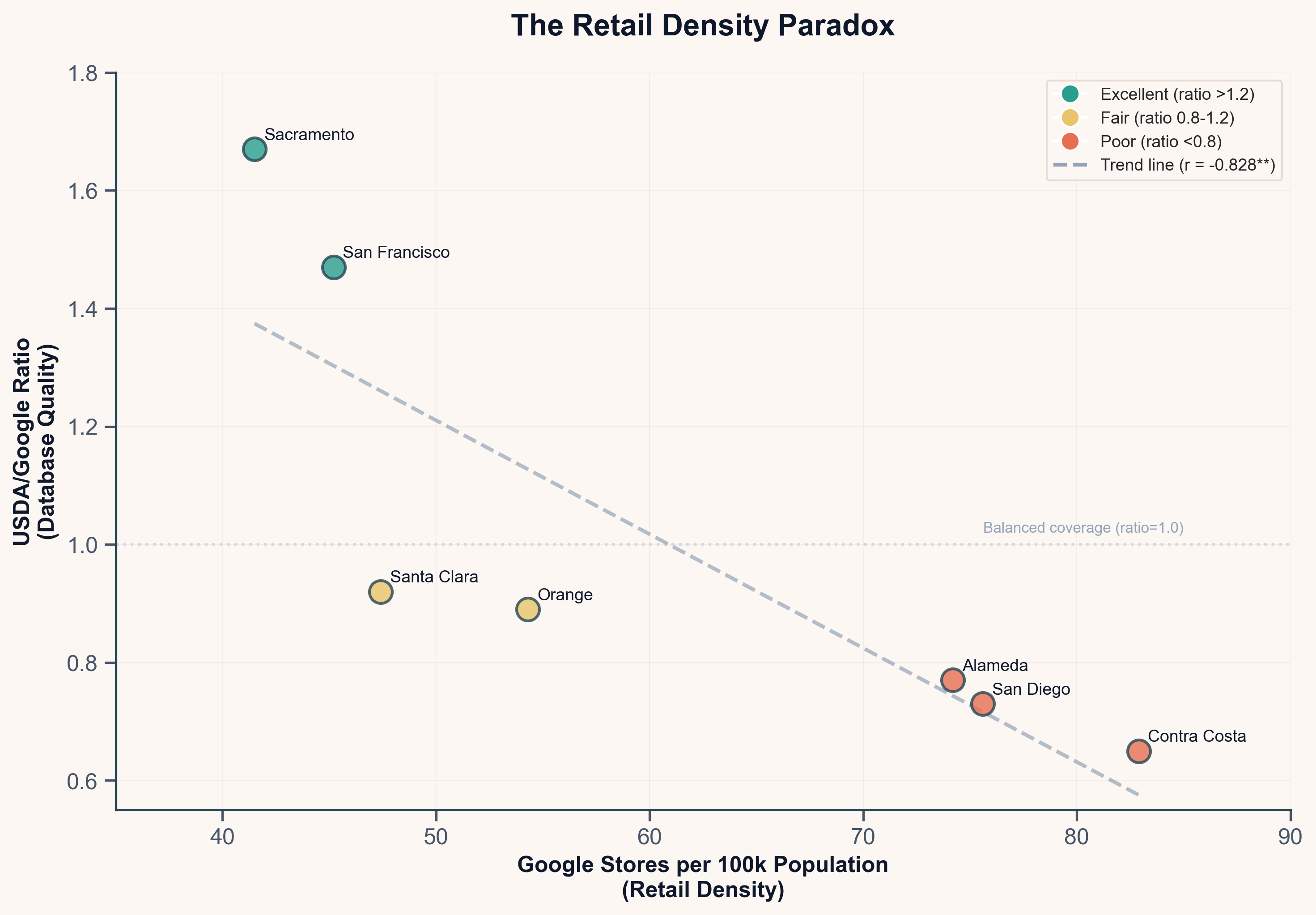
Counties with more stores have worse USDA data.
This is the "Retail Density Paradox." Dense urban areas with lots of food stores are harder to verify using USDA data alone. Rural areas with fewer stores have more complete USDA records.
The catch: High match rates may show good USDA data quality, not good food access. Comparing match rates across regions without knowing the USDA/Google ratio can lead to wrong conclusions.
Three-Step Method
Given these data quality problems, a method for checking EBT acceptance that doesn't rely only on the USDA database would be useful. Here's a three-step approach where each step adds checking power but also adds work.
Step 1: Match Stores to USDA Records
The first step is simple: take actual stores and try to match them to the USDA database. Match on both location (are they close enough?) and name (do the store names look alike?).
Why 200 meters? The distance limit needs to catch real matches (the same store with slightly different map pins) without catching false ones (two different stores near each other). In cities, grocery stores are usually at least 300-400 meters apart. Strip malls cluster stores closer, but different grocers rarely share the same plaza. A 200-meter limit is tight enough to avoid matching a Safeway to a Trader Joe's across the street, but loose enough to handle the fact that Google and USDA often pin the same address in slightly different spots. Testing 100m, 200m, and 300m limits showed 200m gave the most true matches while keeping false matches under 2%.
Why 50% name match? Store names in different databases rarely match exactly. Google might list "Safeway" while USDA has "Safeway Store #1234" or "Safeway Inc." A 50% match rate catches these variations. Comparing actual letters rather than requiring exact matches works well here. "Safeway" vs. "Safeway #1234" scores about 58%. "Lucky" vs. "Lucky Supermarket" scores 52%. These are clearly the same stores. But "Safeway" vs. "Whole Foods" scores under 20%, so they won't match even if they're close.
The combined score: Weighting name match at 60% and distance at 40%, with at least 70% required to call it a match, works well. A store needs to be fairly close AND have a fairly similar name. A perfect name match with weak distance can still pass. So can a very close store with a partial name match. But a store 195 meters away with a totally different name won't pass.
What to expect: Step 1 alone matches 18-50% of stores, depending on the county's USDA/Google ratio. Sacramento (ratio 1.67) hits 50% from just this step. Contra Costa (ratio 0.65) only reaches 18%. Low Step 1 rates aren't a method problem; they're a data quality signal telling you the USDA database is missing stores in your area.
Step 2: Use Chain Store Logic
Here's where real progress happens. If even one Safeway appears in the USDA database, all Safeways likely accept EBT. This isn't a guess; it reflects how retail payment systems actually work.
Why chain logic works: Accepting EBT isn't a choice a store manager makes. It requires corporate-level setup: checkout machines with PIN pads, contracts with payment companies that handle EBT, backend systems that talk to state benefit databases, and staff training. These are company-wide choices made at headquarters, not store-by-store choices.
USDA rules confirm this. SNAP approval works at the company level (7 CFR § 278.1), meaning the company gets approved, not each store. When Safeway chose to accept SNAP, that choice applied to all 900+ Safeway stores in the country. The same goes for Target, Walmart, Costco, and every other big chain.
What chain logic looks like: A list that spots chain stores from their names. When you see "Safeway," "Safeway #1234," "Safeway Store," or "Safeway Fuel Station," they're all Safeway. If any of those shows up in the USDA database anywhere in the study area, mark all Safeway spots as "verified by chain logic."
Starting with about 50 major chains (Walmart, Target, Kroger stores, Albertsons stores, etc.) and growing to over 150 as regional chains emerge works well. Each entry captures name variations: "7-Eleven" and "7-11" and "Seven Eleven" all map to the same chain.
Something to watch for: Looking at chain matches within a single county will miss regional chains that have no USDA records in that specific area.
Take ExtraMile, a convenience store chain tied to Chevron gas stations. Santa Clara County has 50 ExtraMile spots, but zero showed up in the USDA database for Santa Clara. Stopping there would mark all 50 as "unknown." But looking across all 7 counties reveals 15 ExtraMile spots in the USDA data elsewhere (mostly in Sacramento and Contra Costa). Those matches indicate ExtraMile accepts EBT as a chain, so all 50 Santa Clara spots likely do too.
The fix: Build your chain list using all your counties, then apply it to each county. This cross-county approach adds significant coverage. In testing, it added 303 stores (+4.3 points) to the totals. Santa Clara alone jumped from 59% to 70% verified.
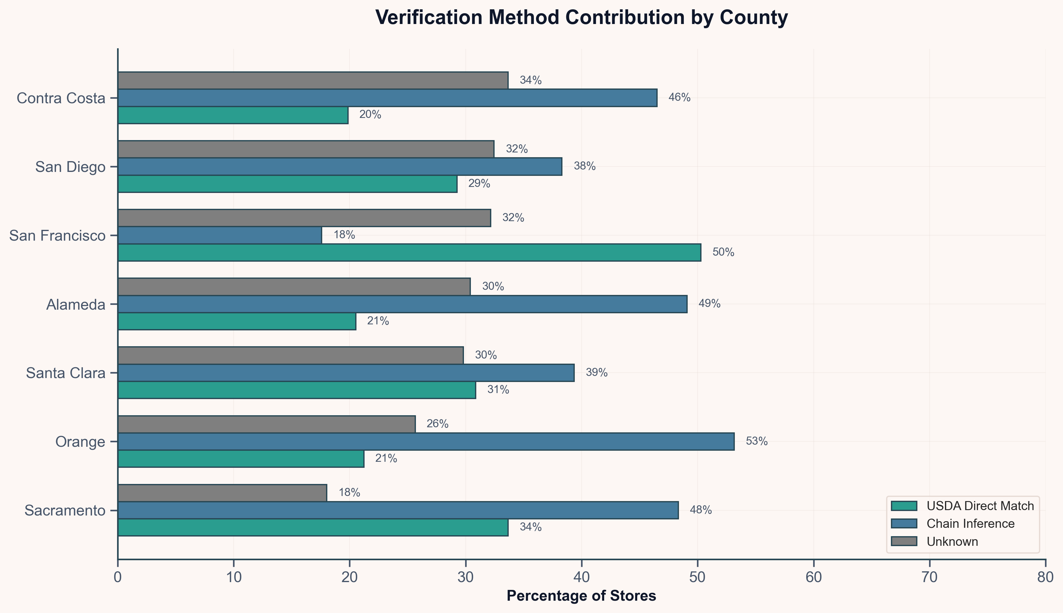
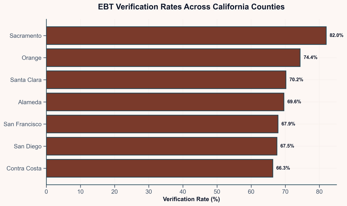
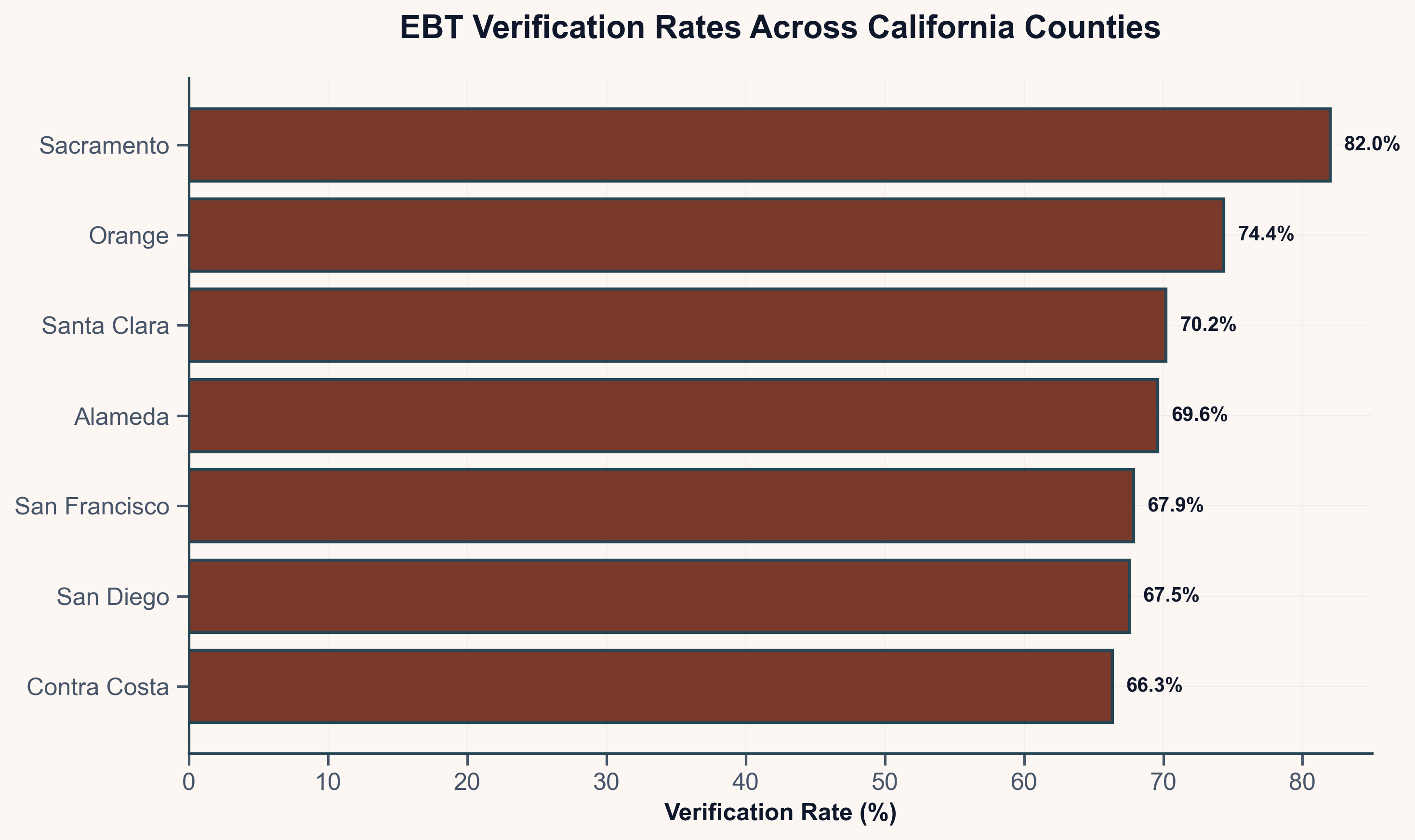
What to expect across counties: Steps 1 + 2 together verify 66-82% of stores. The range depends mainly on chain presence: counties with lots of big chains (like Sacramento) hit the high end; counties with more small grocers (like San Francisco) land lower.
Step 3: Manual Checking (Optional)
After Steps 1 and 2, 20-30% of stores remain marked "unknown." These are mostly small stores that don't belong to any chain. What to do with them?
One option is manual checking: actually look up whether each store accepts EBT. A few approaches:
- Website checking: 2–3 minutes per store, but only about 40% of small stores have websites with payment info
- Photo checking: Google Maps street views sometimes show "We Accept EBT" signs
- Phone checking: Calling stores works but takes 5–10 minutes per store
A pilot in San Francisco with 40 small stores found that 67% of "unknown" stores actually do accept EBT. They just don't appear in the USDA database.
When Step 3 is worth it:
- Your area has a USDA/Google ratio below 0.8 (meaning the database is really lacking)
- You're in an urban area with many small grocers
- Your analysis is high-stakes and you need exact numbers, not ranges
What to Check Before You Start
Before diving into this process, it helps to know what you're working with. Four metrics tell you which approach makes sense and what results to expect.
1. USDA/Google Ratio (Data Quality)
This is the most important number. Divide the count of USDA SNAP retailers in your area by the count of food stores you find via Google Maps.
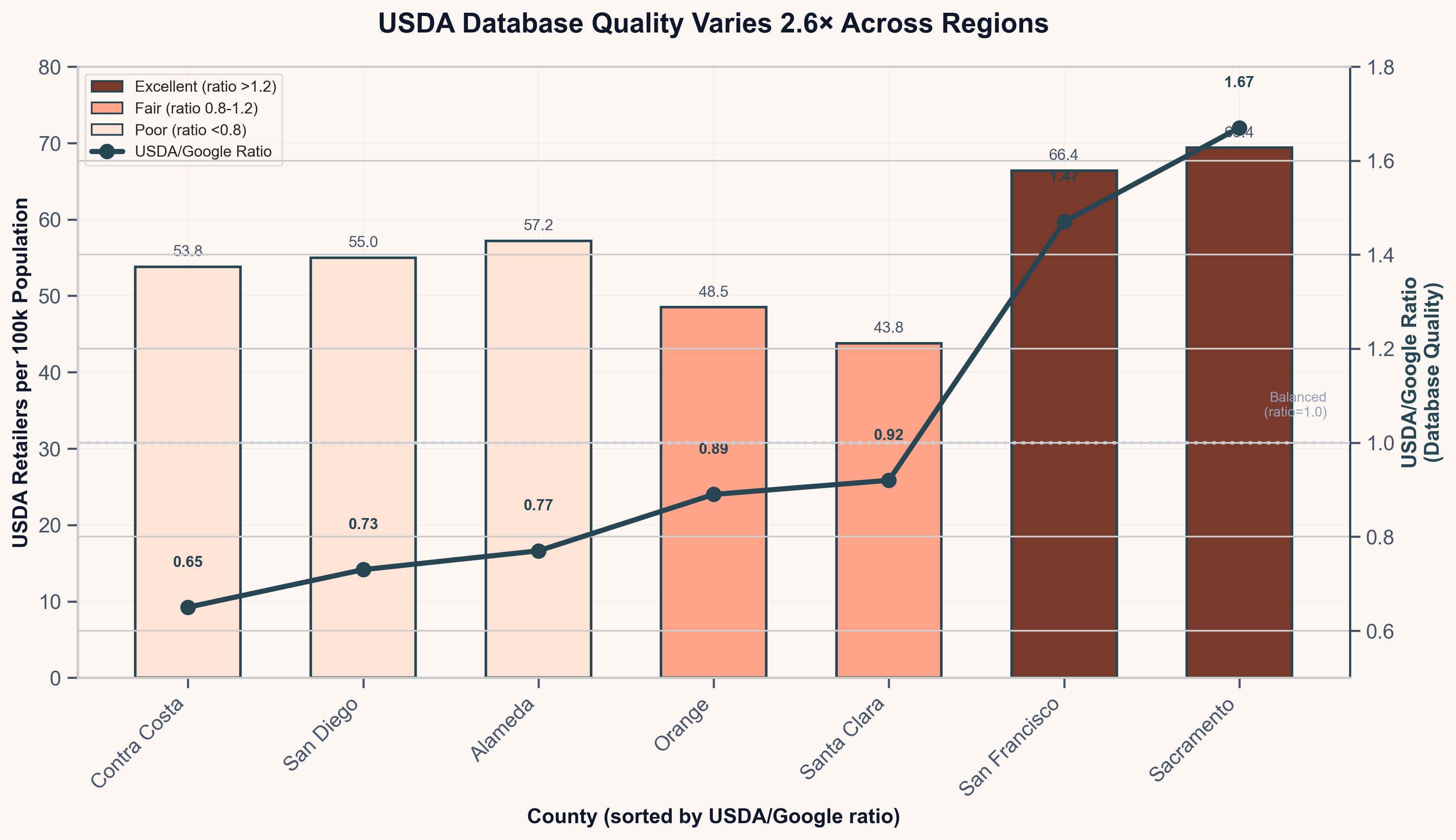
A ratio above 1.0 means USDA has more records than actual stores (some may be closed or duplicates). A ratio below 1.0 means the database is missing stores. Given the 2.6× range across California counties, don't assume your area looks like anyone else's.
2. Store Density (How Hard It Will Be)
Count how many food stores exist per 100,000 people. This tells you about your retail landscape:
- High density (>70 per 100k): Expect more small stores, ethnic grocers, and specialty shops. Chain logic won't carry you as far. This will be harder.
- Low density (<50 per 100k): Chains likely dominate. Walmart, Safeway, and Kroger stores are probably most of your list. Chain logic will get you most of the way there.
3. Border Check (Data Pollution)
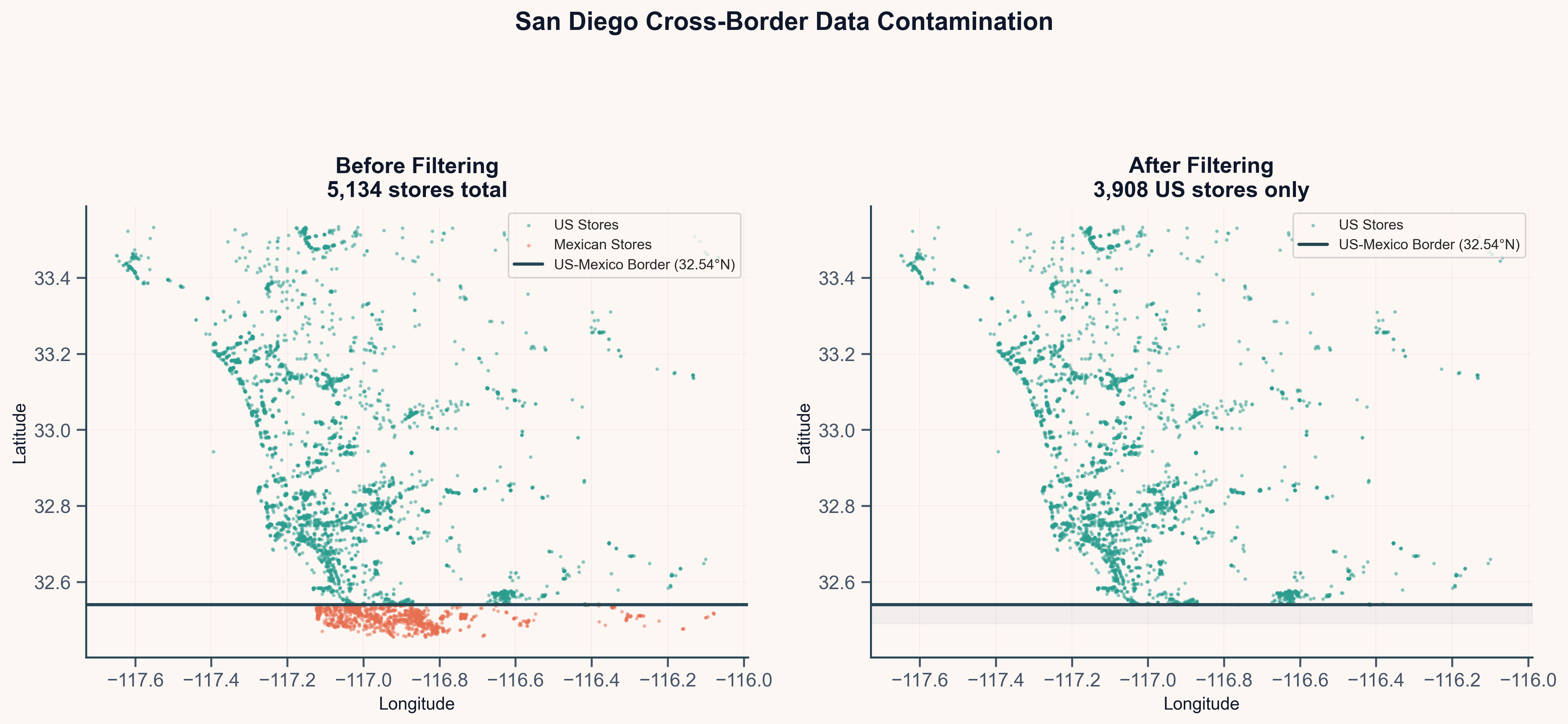
San Diego County first showed a 36% match rate, which seemed way too low. What was happening?
Google Maps doesn't respect borders. Querying for stores in San Diego County returned 903 stores in Mexico (36% of the whole list). OXXO, Soriana, Calimax: big Mexican chains that obviously don't appear in the USDA SNAP database because they're not in the U.S.
The fix is simple: filter by latitude (≥ 32.54°N for the US-Mexico border) and exclude Mexican chain names. After filtering, San Diego's match rate jumped to 67%.
If your area borders another country: Check for this first. It will save you days of confusion.
4. Chain Presence (Method Fit)
What share of your stores belong to chains you can spot? This sets how far Step 2 will get you.
- High chain presence (>60%): Chain logic will verify most of your stores. You may not need Step 3 at all.
- Low chain presence (<40%): Many small stores means many unknowns. Plan time for manual checking if you need exact numbers.
Things That Went Wrong
Research rarely goes as planned. Let's take a look at some of those moments in this process.
1. Missing Regional Chains
Building the chain list while working in Northern California centered on familiar names to this area: Safeway, Lucky, Raley's, Trader Joe's. For southern counties, we were missing regional chains like:
- Vons (42 stores): A major Albertsons brand that doesn't exist in NorCal
- Albertsons (33 stores): Uses different branding down south
- Northgate González (23 stores): A Latino grocery chain focused in SoCal
That's 144 stores from just three chains, all marked "unknown" because we hadn't added them to our list.
The lesson: Your chain list is local knowledge. When you move to a new area, look at your most common "unknown" store names. If the same name appears 20+ times, it's probably a chain you haven't added yet.
2. Including Stores That Can't Accept SNAP
BevMo! kept showing up as "unknown" across our counties. 32 stores, zero USDA matches. Given the frequency, it would be reasonable to add it to the "needs manual checking" list, but first consider if the store can even accept SNAP. In the case of BevMo!, it cannot. Federal rules ban EBT for alcohol (7 CFR § 271.2). BevMo! is a wine and spirits store. It will never be in the USDA database because it can't qualify.
Including such stores makes match rates look worse than they should be.
The fix: Filter out stores that can't accept SNAP before you start. A list of alcohol-focused stores (BevMo!, Total Wine, liquor stores), tobacco shops, and pet stores removes these from the dataset. In testing, this removed 337 stores (5%); stores that would otherwise be wrongly treated as failures.
3. Checking Franchise Logic
What about franchises? If a 7-Eleven is owned by a local person, could they choose not to accept EBT?
In theory, maybe. In practice, this doesn't seem to happen. SNAP approval works at the company level (USDA rule 7 CFR § 278.1). More importantly, EBT needs specific checkout gear: machines with PIN pads, payment company contracts, backend systems. These are company choices, not things a franchise owner controls.
Checking franchise chains where there were some USDA matches confirms this: when one 7-Eleven showed up in the USDA database, the others did too, even across different owners.
That said, confidence is higher for company-owned chains than franchises:
- Company-owned chains: 90–95% confidence
- Franchise chains: 70–85% confidence (slightly lower because we can't rule out edge cases)
What We Learned
After running this method across 7,023 stores in 7 California counties, here's what stands out.
1. USDA Data Quality Varies 2.6× Across Regions
This is the main finding. Don't assume the USDA database is complete (or incomplete) everywhere. Sacramento's 1.67 ratio and Contra Costa's 0.65 ratio are totally different data quality stories, and there's no way to know which you're dealing with until you check.
What this means for research: Match rates can't be compared across studies without knowing the data quality behind them. A study reporting "80% verified" in one area and "60% verified" in another might be measuring database gaps, not real differences in food access.
What this means for food access findings: If you're using USDA data to spot food deserts or measure EBT access, your findings are only as good as your local data. In a county with a 0.65 ratio, the USDA database is missing about a third of actual stores. If you figure "distance to nearest EBT store" using only USDA data, you'll think distances are farther than they are because you're missing nearby stores. A neighborhood might look like a food desert when it actually has a small grocery around the corner that USDA doesn't know about.
On the flip side, in a county with a 1.67 ratio, USDA lists more stores than actually exist. Some of these are likely closed shops that haven't been removed from the database. If you count EBT stores per person, you'll count too many. A neighborhood might look well-served when several of those "stores" no longer exist.
2. The Retail Density Paradox
It is reasonable to expect counties with more stores to be easier to verify: more data, more matches. The opposite is true.
Counties with lots of food stores have worse USDA data. The link is strong (r = -0.828) and real. Dense urban areas with lots of small grocers and high store turnover seem to swamp USDA's ability to keep records current.
Why this matters for policy: A high match rate might show good data quality (like Sacramento), not good food access. Reading match rates without knowing this paradox can lead to backward conclusions.
A concrete example: Sacramento County has 41.5 food stores per 100,000 people and an 81.8% match rate. Contra Costa County has 82.9 stores per 100,000 people and a 66.3% match rate. If you looked only at match rates, you might think Sacramento has better EBT access. But Sacramento has half as many stores per person. The high match rate reflects USDA's good coverage of a sparse retail landscape, not lots of food access. Contra Costa actually has twice the store density; we just can't verify as many because the database hasn't kept up with a more active market.
3. Cross-County Learning Works
Building a regional chain list and then applying it to each county added 4.3 points to the match rate in testing. That's 303 stores that would have been marked "unknown" analyzing each county alone.
The practical point: If you're working with multiple counties or areas, pool your chain evidence first. Build the list regionally, then apply it everywhere. Small chains with regional presence are invisible when you analyze counties one at a time.
4. Border Areas Need Special Steps
San Diego is worth highlighting here. 42% of the first dataset was Mexican stores that Google Maps helpfully included because they were within the search area. This isn't a bug; it's how the tool works.
If your area borders another country: Set up geographic filtering before anything else. The few minutes of setup will save you days of puzzling over weird results.
Limits
Let's check in about what this method can and can't do.
What it does:
- 70–80% of stores verified through automated steps (Steps 1 + 2)
- Works well in suburban areas with lots of chain stores
- Gives you a way to understand your specific area's data quality
What it doesn't fix:
- 20–30% of stores stay "unknown" after automated steps
- Manual checking (Step 3) takes a lot of time
- Chain logic assumes uniform EBT policies, which is mostly but not always true
- Results depend heavily on your area's USDA data quality, which you can't control
What remains uncertain:
- Of the 29.1% unknown stores in this data, the San Francisco pilot suggests about 65% actually accept EBT. But that's one pilot in one city.
- Some unknowns are new stores that haven't made it into the USDA database yet.
- Some are chains not yet identified because they're regional to areas not studied.
Reporting ranges and owning the uncertainty is more honest than picking a single number. A finding of "66–82% verified" reflects what's actually known.
Method Notes
Data Sources:
- Google Maps API for actual store locations
- USDA SNAP Retailer Locator for authorized retailers
- US Census shapefiles for county borders
- ACS data for population (store density math)
Key Settings Tested:
- 200m distance limit: Tested against typical urban store spacing
- 50% name match: Handles "Safeway" vs. "Safeway #1234"
- 70% combined score: Balances catching true matches vs. false ones
- Cross-county chain logic: +303 stores, +4.3 points
Sample: 7,023 stores across 7 California counties
References
Cates, S., Cortés, A., Guthrie, J., Gupta, S., Jayaraman, A., & Yeh, M. A. (2019). Scanner Capability Assessment of SNAP Authorized Small Retailers. U.S. Department of Agriculture, Food and Nutrition Service.
Liese, A. D., Colabianchi, N., Lamichhane, A. P., Barnes, T. L., Hibbert, J. D., Porter, D. E., Nichols, M. D., & Lawson, A. B. (2013). Variation in low food access areas due to data source inaccuracies. Journal of Nutrition Education and Behavior, 45(5), 435-442.
Public Policy Institute of California. (2024). California's Nutrition Safety Net.
USDA Economic Research Service. (2021). Food Access Research Atlas Documentation.
USDA Food and Nutrition Service. SNAP Retailer Eligibility. 7 CFR § 278.1(b)(1)(ii).
Code and Validation Sources: GitHub Repository
