The Widening Gap: Why Some Neighborhoods Are Falling Behind
County-wide SNAP rates rose 2 points over four years. But what happens when we look at neighborhoods instead of the whole county? A more complex picture emerges.
County-wide SNAP rates tell a simple story: Santa Clara County's food insecurity rose from 4.7% in 2019 to 6.7% in 2023.[1] A two-point increase over four years. Concerning, but manageable.
But what happens when we look at neighborhoods instead of the whole county?
A more complex picture emerges. Of 334 census tracts with complete data, 160 are getting worse. 67 are getting better. The rest hold steady. Nearly half the county is moving in the wrong direction while one-fifth recovers.
These changes aren't random. They cluster by vulnerability. In the highest-vulnerability neighborhoods, 76.7% are deteriorating. In the lowest-vulnerability neighborhoods, just 15.9% are.
Let's explore what's happening.
The Background
Research shows that food insecurity tends to concentrate in certain places and persist over time.[2][3] Poor neighborhoods tend to stay poor. Communities that struggled before economic shocks tend to struggle more after them.
What's less clear is whether neighborhoods are moving toward the county average or pulling apart. Are struggling areas catching up? Falling behind? Holding steady?
To find out, we classified each tract's four-year path:
- Deteriorating: SNAP participation rose more than 1 percentage point
- Stable: Changed less than 1 percentage point
- Improving: Fell more than 1 percentage point
This simple classification reveals patterns hidden in the county average.
How We Did This
Where: Santa Clara County, California (408 census tracts, 1.9 million residents)
Data: Census ACS 5-Year Estimates (2019-2023) for SNAP rates by tract, plus demographics like race, education, poverty, and vehicle access.
Approach: We tracked 408 tracts over 5 years, classified their trajectories, then looked at how trajectories relate to vulnerability and demographics.
Note: 334 of 408 tracts (82%) have complete data. The other 112 were excluded due to boundary changes or missing years.
Nearly Half the County Is Getting Worse
Let's start with the big picture.
| Trajectory | Tracts | Percentage | Average Change |
|---|---|---|---|
| Deteriorating | 160 | 47.9% | +4.4 points |
| Stable | 107 | 32.0% | +0.1 points |
| Improving | 67 | 20.1% | -3.1 points |
More than twice as many tracts are deteriorating as improving. This isn't a balanced story where some get better and some get worse. The county is tilting toward worse outcomes.
Figure 1 shows how these changes are distributed. Most deteriorating tracts show increases of 2-6 points, but some increased 15 points or more.

Something to Note
Deteriorating tracts went from 5.2% SNAP participation in 2019 to 9.6% in 2023. That's an 86% increase.
Improving tracts went from 7.6% to 4.5%. A 41% decrease.
Notice what happened? The tracts getting better started worse. The tracts getting worse started better. Their paths crossed.
This isn't just things evening out. Something different is happening in these neighborhoods.
Vulnerable Areas Are Falling Behind
We might ask: does baseline vulnerability predict which direction a tract goes?
It does. Strongly.
Figure 2 shows trajectory by vulnerability quintile. The coral line (deteriorating) rises sharply from left to right. The teal line (improving) stays flat and low.

| Vulnerability | Deteriorating | Stable | Improving |
|---|---|---|---|
| Q1 (Lowest) | 16% | 67% | 18% |
| Q2 | 35% | 33% | 32% |
| Q3 | 43% | 37% | 20% |
| Q4 | 66% | 15% | 19% |
| Q5 (Highest) | 77% | 11% | 12% |
Two things stand out.
First, vulnerability predicts deterioration. Low-vulnerability tracts are mostly stable (67%). High-vulnerability tracts are mostly deteriorating (77%).
Second, improvement is rare at the top. Only 12% of highest-vulnerability tracts got better. These communities aren't bouncing back from COVID. They're falling further behind.
What Do Deteriorating Tracts Look Like?
We can look at demographics to see what distinguishes deteriorating tracts from stable or improving ones.

| Characteristic | Deteriorating | Stable | Improving |
|---|---|---|---|
| Hispanic % | 28% | 17% | 32% |
| Asian % | 38% | 41% | 33% |
| Bachelor's+ % | 50% | 65% | 48% |
| Poverty rate | 8.5% | 5.4% | 6.8% |
| No vehicle % | 7.1% | 3.8% | 4.8% |
| Single parent % | 41% | 33% | 39% |
Poverty stands out. Deteriorating tracts have 57% higher poverty rates than stable tracts. Economic distress predicts worsening food security.
Education matters too. Stable tracts have much higher college attainment (65%) than deteriorating ones (50%). Communities with more educated residents are holding steady.
Race patterns are mixed. Improving tracts actually have the highest Hispanic share (32%). Deteriorating tracts are slightly below average. The story isn't simply about demographics.
Cars matter. Deteriorating tracts have nearly twice the rate of households without vehicles (7.1% vs 3.8%). Families without cars face barriers to food, jobs, and services.
Where Is This Happening?
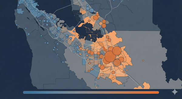
We can see the geographic pattern on a map. Deterioration clusters in specific areas.

Getting worse:
- East San Jose (Alum Rock, East Foothills, Evergreen)
- South County (Gilroy, Morgan Hill)
- North San Jose industrial areas
Holding steady:
- West Valley (Los Gatos, Saratoga, Campbell)
- Cupertino and western Sunnyvale
- Palo Alto and Los Altos
Getting better:
- Scattered across the county
- Some in central San Jose
- Some in Mountain View near tech employers
When one tract deteriorates, neighbors often do too. This suggests shared causes: labor markets, school districts, or local economic shocks that affect whole areas.
These Aren't One-Time Spikes
We might wonder: are these sudden changes or gradual trends?
Figure 5 shows individual tract paths over time. Each thin line is one tract. The thick line is the average.

Deteriorating tracts show steady year-over-year increases. The average rises from 5.2% to 9.6% without pausing. This isn't a COVID spike that's recovering. It's sustained worsening through the recovery period.
Stable tracts bounce around but stay in a narrow band. These communities weathered COVID without lasting damage.
Improving tracts started higher and dropped fast, especially 2019-2021, then leveled off. This could reflect better economic circumstances or food-insecure households moving away.
What's Driving This?
The data show divergence clearly. They can't tell us exactly why.
Several explanations are possible.
Different Economic Recoveries
High-vulnerability tracts may have more service workers who faced longer unemployment and slower wage recovery.[4] Tech workers returned to high-paying remote jobs. Service workers faced reduced hours and stagnant wages.
This fits the education pattern: stable tracts have 15 points higher college attainment.
Housing Squeezing Out Food
As rents rose after COVID, stretched households had to choose between rent and food.[5] SNAP enrollment increased not because incomes fell, but because housing took more of static incomes.
Santa Clara County rents rose 18% from 2019-2023. Deteriorating tracts have higher baseline poverty, suggesting less cushion. Research shows rent-burdened households face roughly three times the odds of food insecurity.[6]
People Moving
Improving tracts may show falling SNAP rates not because residents are better off, but because food-insecure families moved to cheaper areas while higher-income families moved in.
Improving tracts have the highest Hispanic share, and Hispanic households showed net outmigration from the county during this period.
The Honest Answer
We don't know which explanation dominates. Separating them requires household-level data we don't have. The tract data show that places are diverging, but can't tell us whether people are diverging or moving.
Still, the finding matters. Regardless of why 160 tracts are deteriorating, those neighborhoods need attention.
Lessons from These Results
In a county with these patterns, some lessons emerge.
Understanding These Neighborhoods
Understanding food security in deteriorating neighborhoods will depend on understanding SNAP outreach, food pantries, and emergency aid in these areas. The 56 deteriorating Q5 tracts contain about 68,000 residents. Learning more about existing resources and gaps in these specific communities would be a starting point.
Levels and Trajectories Both Matter
Monitoring current SNAP rates is useful. Adding trajectory indicators would provide additional context. A tract at 6% that's been rising 1 point per year tells a different story than a tract at 8% that's been stable.
Study the Improving Tracts
The 67 improving tracts offer lessons. What changed? Did specific programs work? Did jobs improve? Understanding what helped could inform thinking about deteriorating areas.
Consider Housing in the Conversation
If housing costs are contributing to food insecurity increases, food programs alone may not be enough. Housing costs and housing-based solutions (rent stabilization, housing vouchers, income support) should be considered in the conversation around food stability.
Limitations
Missing tracts: 112 tracts (27%) lack complete data due to Census boundary changes. These tend to be in growing or changing areas.
Smoothed data: 5-year ACS estimates average over time. True year-to-year swings may be larger.
Places vs. people: We can't tell whether tract changes reflect residents' changing circumstances or different people moving in and out.
Threshold choice: The 1-point threshold is somewhat arbitrary. Different thresholds would reclassify some tracts.
Summing Up
What We Can't Say Yet
Why this is happening: Is it economic recovery differences, housing pressure, or demographic change? Separating these requires household-level longitudinal data.
Where this is going: Will deteriorating tracts keep worsening, stabilize, or recover? We need 2024-2025 data.
What would help: Would targeted interventions reverse trajectories? Geographic concentration of resources could test this.
What We Can Say
The divergence is real. 160 tracts (48%) deteriorating vs. 67 (20%) improving. More than 2:1 worsening. 77% of highest-vulnerability tracts are deteriorating.
The pattern is consistent. It holds across different thresholds. It follows the vulnerability gradient. It clusters geographically in predictable areas.
The scale matters. 160 deteriorating tracts contain about 195,000 residents. An average 4.4-point SNAP increase represents substantial worsening. This compounds existing inequality.
Data: Census ACS 5-Year Estimates 2019-2023. Analysis conducted October 2025.
References
[1] California Department of Social Services, CalFresh Data Dashboard, 2024.
[2] Gundersen, C., & Ziliak, J. P. (2015). Food Insecurity and Health Outcomes. Health Affairs, 34(11), 1830-1839.
[3] Misiaszek, C., Buzogany, S., & Freishtat, H. (2018). Overlapping geographic clusters of food security and health. PLOS ONE, 13(8), e0201672.
[4] Rothwell, J., & Van Dijcke, D. (2021). The impact of COVID-19 on labor markets and inequality. Monthly Labor Review, U.S. Bureau of Labor Statistics.
[5] Harmon, D., et al. (2023). Rental assistance improves food security and nutrition. Journal of the Academy of Nutrition and Dietetics, 123(4), 573-583.
[6] Pang, H., et al. (2024). SNAP emergency allotments, emergency rent assistance, rent burden, and housing and food security. Preventing Chronic Disease, 21, E58.
