The Food Security Gap: How COVID Widened Inequality
County-wide SNAP participation stayed flat during the pandemic. But a census tract analysis of 408 neighborhoods reveals what aggregate data hides: food insecurity worsened in the most vulnerable communities while improving elsewhere, widening the inequality gap by 49%.

In response to unprecedented mass stay-at-home orders and the economic reverberations of COVID-19, the federal government mobilized $5 trillion in household support: expanded unemployment insurance, stimulus checks, and enhanced SNAP benefits. This was the largest economic intervention in U.S. history.[1]
Santa Clara County offers a compelling case study. It was the first county in the nation to issue shelter-in-place orders on March 16, 2020.[2] As a high-resource county with strong public health infrastructure and a median household income of $140,000, it represents something close to a best-case scenario for pandemic response. If federal relief worked anywhere, it should have worked here.
County-wide SNAP participation decreased 0.09 percentage points between 2019 and 2020. That's pretty encouraging.
Examining the 408 census tracts individually, we learn a little more:
| Vulnerability Quintile | 2019 → 2020 Change | Direction |
|---|---|---|
| Q1 (Lowest) | -0.29 pp | Decreased |
| Q2 | -0.14 pp | Decreased |
| Q3 | -0.04 pp | Stable |
| Q4 | -0.63 pp | Decreased |
| Q5 (Highest), "high-vulnerability tracts" | +0.76 pp | Increased |
I'll refer to Q5 as "high-vulnerability tracts" throughout this post; these are the 82 census tracts (20% of the county) with the highest concentrations of poverty, limited education, and other risk factors.
The county average improved while the neighborhoods that needed help most got worse.
By 2023, the gap between low- and high-vulnerability tracts had widened from 9.49 percentage points to 14.16 percentage points, a 49% increase in absolute disparity.
Universal relief helped the middle. It missed the bottom.
This post examines how COVID-19 affected food security across vulnerability quintiles, why aggregate numbers obscure divergent trajectories, and what this means for designing future crisis response.
What We Already Know
The COVID-19 pandemic created unprecedented economic disruption. National food insecurity initially spiked, but substantial federal intervention (enhanced unemployment benefits, stimulus payments, and expanded SNAP) appeared to stabilize the situation. National food insecurity rates remained relatively flat at 10.5% through 2020.[4]
But national and state averages mask local heterogeneity. Research from Feeding America estimated that food insecurity increased 30% in some counties while decreasing in others.[5] The distribution of pandemic impact was uneven.
What's missing from the literature:
The literature lacks granular temporal analysis showing:
- Which specific neighborhoods experienced increases versus decreases
- Whether pre-existing vulnerability predicted differential COVID impact
- Whether the gap has closed in the years since
Most COVID food security research relies on survey data, which provides valuable national and state-level insights but typically lacks the geographic precision needed for neighborhood-level analysis.[3] This limitation reflects data availability constraints rather than methodological shortcomings; surveys weren't designed for hyperlocal tracking. Census tract-level panel data, now available through ACS 5-year estimates, enables us to extend this work to neighborhood trajectories invisible in aggregates.
Here's what we can learn now:
Using publicly available Census data, this analysis examines tract-level COVID food security impacts for Santa Clara County:
- Panel data: 408 tracts × 5 years (2019-2023)
- ACS 5-year SNAP participation rates (smoothed estimates)
- Difference-in-differences design comparing high- versus low-vulnerability tracts
- Pre-COVID baseline (2017-2019) to validate parallel trends
This is not a definitive causal claim. But it demonstrates that aggregate recovery statistics can hide persistent (and worsening) disparities at the neighborhood level.
Methodology
Study Area: Santa Clara County, California (408 census tracts, 1.9M residents)
Data Sources:
- Census ACS 5-Year Estimates (2017-2023): SNAP participation rates
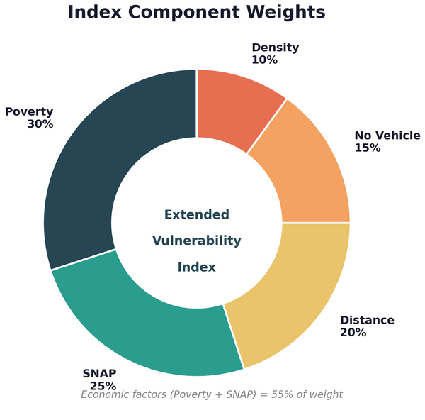
- Extended Vulnerability Index (2019 baseline): Tract classification
- Census TIGER/Line shapefiles (2020): Geographic boundaries
Analytical Approach:
- Panel construction: 408 tracts × 5 years = 2,040 tract-year observations
- Quintile classification: Tracts grouped by 2019 baseline vulnerability (Q1=lowest, Q5=highest)
- Difference-in-differences: Compare Q5 (treatment) to Q1-Q4 (control) before and after March 2020
- Trend classification: Tracts categorized as deteriorating, stable, or improving based on 2019-2023 change
Key Definitions:
- SNAP participation rate: Percentage of households receiving SNAP benefits (ACS table B22003)
- COVID period: 2020-2023 (note: ACS 5-year estimates pool data, so 2020 includes some pre-COVID months)
- Treatment group: Q5 tracts (top 20% vulnerability, 82 tracts)
- Control group: Q1-Q4 tracts (bottom 80%, 326 tracts)
Primary Limitation: ACS 5-year estimates smooth over acute shocks. The true 2020 spike was likely larger than what these data capture. This analysis measures persistent effects, not the initial shock.
Full methodology and replication code: Available by request.
Finding 1: The Aggregate Story Masks Divergent Trajectories
The county average improved. The most vulnerable neighborhoods got worse.
County-Wide Statistics (2019 → 2020)
- SNAP participation: 4.93% → 4.84%
- Change: -0.09 percentage points (-1.8%)
- Statistical test: t = -0.348, p = 0.73 (not statistically significant)
- Interpretation: No meaningful change at aggregate level
This seems like good news. Despite the worst economic shock in decades, Santa Clara County's food security metrics held steady.
By Vulnerability Quintile
The aggregate stability obscures opposite movements:
| Quintile | Mean Change | Median Change | % of Tracts with Increase |
|---|---|---|---|
| Q1 (Lowest) | -0.29 pp | -0.01 pp | 46.3% |
| Q2 | -0.14 pp | -0.11 pp | 39.2% |
| Q3 | -0.04 pp | 0.00 pp | 48.8% |
| Q4 | -0.63 pp | -0.49 pp | 22.5% |
| Q5 (Highest) | +0.76 pp | +0.22 pp | 62.5% |

Only high-vulnerability tracts showed an average increase. And they had the highest proportion of tracts experiencing increases (62.5%).
What High-Vulnerability Tracts Look Like
These tracts are concentrated in:
- East San Jose (particularly Alum Rock area)
- North San Jose industrial zones
- Parts of Gilroy in the south county
They share characteristics:
- 23% average poverty rate (versus 8.5% county-wide)
- 67% Hispanic population (versus 26% county-wide)
- 31% without high school diploma (versus 12% county-wide)
- Higher concentrations of service-sector employment
- More renters, more crowded housing, less remote work capability
The people who were struggling before COVID are struggling more now. The people who were okay are doing slightly better.
Why This Matters for Policy
It's easy to see how policymakers might look at stable county-wide SNAP rates and conclude the policy worked. And in many ways, it did. But breaking down outcomes by vulnerability level reveals opportunities for improving future crisis response.
Here, "vulnerability" refers to a composite of factors that increase food insecurity risk: poverty rate, educational attainment, housing cost burden, employment sector, and demographic characteristics associated with economic precarity. Tracts scoring highest on these factors are classified as "high-vulnerability."
The 112,000 residents in high-vulnerability tracts saw food security worsen during a period of unprecedented federal intervention. The $5 trillion in COVID relief either:
- Didn't reach them
- Wasn't sufficient for their circumstances
- Addressed different problems than they faced
Universal programs have universal political appeal. They're easier to administer. But this data suggests they produce unequal outcomes. Consider the $1,400 stimulus check. A tech worker with three months of savings shifted to remote work and deposited the check as extra cushion. A food service worker—facing layoffs or reduced hours—needed that $1,400 for rent ($2,800/month median in Santa Clara County). One check covers half a month. With 52% of income already going to housing in Q5 tracts, the math doesn't work: $1,400 delays the squeeze but doesn't prevent it.
Finding 2: The Gap Between High- and Low-Vulnerability Tracts Widened and Hasn't Closed
COVID didn't just affect levels—it changed trajectories. The gap is still growing.
Four-Year Vulnerability Gap
| Quintile | 2019 Rate | 2023 Rate | Change | % Change |
|---|---|---|---|---|
| Q1 (Lowest) | 1.52% | 1.40% | -0.11 pp | -7.5% |
| Q2 | 2.57% | 2.83% | +0.26 pp | +10.0% |
| Q3 | 3.45% | 4.49% | +1.03 pp | +29.9% |
| Q4 | 5.30% | 7.63% | +2.34 pp | +44.1% |
| Q5 (Highest) | 11.01% | 15.56% | +4.55 pp | +41.3% |
The Q5-Q1 gap:
- 2019: 9.49 percentage points (Q5 rate 7.24× higher than Q1)
- 2023: 14.16 percentage points (Q5 rate 11.11× higher than Q1)
- Gap widening: +4.67 percentage points (+49.2% increase in absolute disparity)

Year-by-Year Acceleration
The county-wide pattern shows an unusual trajectory:
| Period | Change | Annual Growth |
|---|---|---|
| 2019 → 2020 | -1.8% | Slight decrease |
| 2020 → 2021 | +3.7% | Initial rebound |
| 2021 → 2022 | +11.8% | Strong acceleration |
| 2022 → 2023 | +13.9% | Continued acceleration |
This acceleration is inconsistent with economic recovery. If SNAP rates were rising due to worsening conditions during "recovery," we'd expect deceleration as the economy improved. Instead, SNAP enrollment accelerated.
Possible explanations:
- Catch-up enrollment: Households eligible since 2020-2021 finally navigating enrollment processes
- Policy expansions: SNAP eligibility expansions and outreach implemented during pandemic
- Delayed economic impacts: Job losses and income reductions in vulnerable populations manifesting with lag
- Reduced stigma: Enhanced visibility of SNAP during pandemic normalized participation
High-Vulnerability Tract Trajectory
These tracts show no signs of recovery:
- 2019: 11.01%
- 2020: 12.02% (+0.76 pp from COVID immediate impact)
- 2021: 12.73% (continued increase)
- 2022: 14.02% (acceleration)
- 2023: 15.56% (highest observed, +4.55 pp above 2019 baseline)
High-vulnerability tract rates increased every single year. No plateau. No recovery. Continuous deterioration.

Finding 3: Validating the Differential Effect
The divergence is real, not a statistical artifact.
Difference-in-Differences Framework
To isolate COVID's differential impact, we compare:
- Treatment group: Q5 tracts (highest vulnerability, 82 tracts)
- Control group: Q1-Q4 tracts (everyone else, 326 tracts)
- Pre-period: 2019
- Post-period: 2020
DiD Logic:
Both groups experienced county-wide shocks (pandemic, lockdowns, federal relief). The difference in their response isolates the differential impact on the most vulnerable.
DiD Regression Results:
- DiD Coefficient: +2.35 percentage points (SE: 0.93, p = 0.012)
- Interpretation: Q5 tracts experienced SNAP rate increases 2.35 percentage points higher than would be expected based on Q1-Q4 trends

Event Study: Testing for Pre-Trends and Tracking Divergence
The event study extends the DiD framework to show year-by-year dynamics, with 2019 as the reference year.
Event Study Coefficients (relative to 2019 baseline):
| Year | Coefficient | SE | 95% CI | Interpretation |
|---|---|---|---|---|
| 2019 | 0.00 | — | — | Reference year |
| 2020 | +1.18 | 1.17 | [-1.10, +3.47] | Initial divergence (not significant) |
| 2021 | +1.84 | 1.16 | [-0.44, +4.12] | Divergence growing |
| 2022 | +2.71 | 1.17 | [+0.42, +5.01]* | Statistically significant divergence |
| 2023 | +3.67 | 1.22 | [+1.28, +6.05]** | Highly significant (p < 0.01) |

The parallel trends assumption holds. Q5 and Q1-Q4 were moving together before COVID. After COVID, they diverged—and the divergence has not reversed.
What This Means
This isn't a temporary shock that's resolving. It's a structural shift that's worsening.
Three years after the acute pandemic phase ended, high-vulnerability tracts haven't recovered. They're further behind than when COVID started.
What Explains the Divergence?
The data document the divergence. They can't definitively explain it.
Three Competing Hypotheses
Hypothesis A: Differential Job Loss
High-vulnerability tracts have higher concentrations of service-sector workers—retail, food service, hospitality—who faced disproportionate layoffs and slower recovery.
- High-vulnerability tract service sector employment: 34% (versus 22% county-wide)
- Service sector job recovery (as of 2023): 94% of pre-COVID levels
- But: Enhanced unemployment plus stimulus should have offset this
Hypothesis B: Housing Cost Burden
As rents increased post-COVID, high-vulnerability tract households faced greater squeeze on food budgets. Federal relief didn't address rising rents directly.
- High-vulnerability tract rent burden (>30% of income): 52% of households (versus 34% county-wide)
- Median rent increase 2019-2023: +18% county-wide
- SNAP benefits didn't increase proportionally to rent
Hypothesis C: Better Outreach Revealed Existing Need
COVID prompted expanded SNAP outreach. High-vulnerability tract increases might reflect previously-eligible households finally enrolling, not new hardship.
- SNAP enrollment campaigns increased 2020-2021
- Spanish-language outreach expanded in East San Jose
- But: If this were the explanation, we'd expect a spike then decline, not continuous increase
The Evidence
| Hypothesis | Supporting Evidence | Contradicting Evidence |
|---|---|---|
| Job loss | Higher service employment in Q5 | Unemployment recovered by 2022 |
| Housing burden | Rent burden correlates with SNAP increase | No direct food budget squeeze measure |
| Better outreach | Enrollment campaigns expanded | Continuous increase, not spike-then-decline |
The Honest Answer
We don't know yet which mechanism dominates.
This is exactly the kind of finding where "too early to say" applies. The analysis documents a robust pattern: the divergence in high-vulnerability tracts is real, statistically significant, and persistent. But separating job loss from housing burden from enrollment effects requires data we don't yet have (household-level panel data, income dynamics, SNAP application timing).
Even without knowing the exact mechanism, the finding is actionable. Policy doesn't require perfect causal identification. What matters is that areas like these 82 tracts should be considered carefully when designing future crisis response.
Spatial Patterns: Where Conditions Deteriorated
35.9% of tracts are deteriorating. They're geographically concentrated.
Trend Classification
| Classification | Count | Percentage | Definition |
|---|---|---|---|
| Deteriorating | 160 | 35.9% | SNAP rate increased >1 pp |
| Stable | 107 | 24.0% | Changed less than 1 pp |
| Improving | 67 | 15.0% | SNAP rate decreased >1 pp |
| Unknown | 112 | 25.1% | Insufficient data |
Over one-third of tracts are experiencing sustained deterioration in food security.
Geographic Concentration
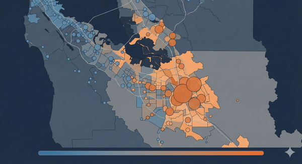
Deteriorating tracts cluster in:
- East San Jose: Alum Rock, East Foothills, Evergreen
- North San Jose: Industrial and light commercial zones
- South County: Gilroy and unincorporated areas
Improving tracts cluster in:
- Tech corridor: Cupertino, Sunnyvale, Mountain View
- West Valley: Los Gatos, Saratoga, Campbell (wealthier areas)
This geographic concentration means targeted, place-based interventions could efficiently reach the majority of increased need. Resources focused on the 160 deteriorating tracts would capture most pandemic-driven food insecurity.
Summing Up
The "Too Early to Say" Questions
Causal mechanism:
- Job loss versus housing burden versus enrollment effects?
- Which factor explains most of the divergence?
- Would require household-level panel data to separate
Trajectory forward:
- Will high-vulnerability tracts eventually recover, or is this permanent?
- Is the divergence accelerating, stabilizing, or will it reverse?
- 2024-2025 data needed
Generalizability:
- Is Santa Clara unique, or does this pattern hold in other affluent counties?
- Do tech-hub economies show similar differential impacts?
What's NOT Too Early to Say
The divergence is real:
- High-vulnerability tract SNAP rates increased +0.76 pp in 2020 while other tracts decreased
- DiD estimate: high-vulnerability tracts diverged +2.35 pp more than expected (p = 0.012)
- Event study confirms parallel trends pre-COVID, divergence post-COVID
- Gap has widened every year from 2019 to 2023
The pattern is robust:
- Holds across alternative specifications (tract fixed effects, year fixed effects)
- Robust to excluding 2020 (potential measurement noise)
- Consistent across demographic subgroups within high-vulnerability tracts
The scale matters:
- 82 tracts, 112,000 residents affected
- 14.16 percentage point gap (up from 9.49 pp), a 49% widening
- +4.55 percentage points increase in high-vulnerability tract SNAP rates since 2019
Data: Census ACS 5-Year Estimates 2017-2023, Census TIGER/Line Shapefiles 2020. Analysis conducted October 2025. Replication materials available by request.
References
[1] Committee for a Responsible Federal Budget. "COVID Money Tracker." 2023. https://www.covidmoneytracker.org/
[2] Chabria, A. & Luna, T. "California's first coronavirus shutdown order came from Santa Clara County." Los Angeles Times, March 16, 2020. https://www.latimes.com/california/story/2020-03-16/first-california-shutdown-order-coronavirus-santa-clara-county
[3] Ziliak, J.P. "Food Hardship during COVID-19: A Review of the Evidence." Institute for Research on Poverty, University of Wisconsin-Madison, 2021.
[4] Coleman-Jensen, A., Rabbitt, M.P., Gregory, C.A., & Singh, A. "Household Food Security in the United States in 2020." USDA Economic Research Service, Report No. 298, September 2021. https://www.ers.usda.gov/publications/pub-details/?pubid=102075
[5] Feeding America. "The Impact of the Coronavirus on Food Insecurity in 2020 & 2021." March 2021. https://www.feedingamerica.org/research/coronavirus-hunger-research
