Housing tenure shapes food access in ways that are not immediately obvious. Renters are less likely to own cars than homeowners, making transit access to groceries particularly consequential for this group.1 If we want to understand who faces the greatest barriers to healthy food, we need to examine how housing status intersects with transportation options.
When we compare food access between renter-dominated and owner-dominated tracts across California's 9,039 residential census tracts, we find that renter-dominated tracts have better grocery access by every metric: shorter distances (0.58 vs. 0.94 miles), lower food desert rates (8.4% vs. 18.2%), and lower mobility desert rates (9.8% vs. 13.6%).2 This pattern reflects urban geography more than housing policy: renters concentrate in dense urban cores where stores and transit are abundant.
But if we look more closely, the pattern obscures important variation. Within income levels, the renter advantage narrows substantially. And renter-dominated tracts, despite better average access, have higher overall vulnerability because of compounding economic factors. Here is what we find when we examine the relationship between housing tenure and food access.
The Descriptive Pattern
Comparing renter-dominated (>50% renter) and owner-dominated (>50% owner) tracts:
| Metric | Renter-Dominated | Owner-Dominated |
|---|---|---|
| Tracts | 3,847 | 5,192 |
| Mean distance to grocery | 0.58 mi | 0.94 mi |
| Traditional food desert rate | 8.4% | 18.2% |
| Mobility desert rate | 9.8% | 13.6% |
| Mean transit stops within 0.5 mi | 8.4 | 3.2 |
| Mean vulnerability index | 0.358 | 0.287 |
Figure 12.1: Food Access Metrics by Housing Tenure
Renter-dominated: >50% renter-occupied (n = 3,847); owner-dominated: >50% owner-occupied (n = 5,192). Food desert: grocery >1 mi; mobility desert: grocery <1 mi but inadequate transit. N = 9,039 California census tracts. Data: ACS 2018–2022, SafeGraph (2023), Cal-ITP (2024).
What This Shows
Renters have better locational access. Renter-dominated tracts average 0.58 miles to the nearest grocery store, compared to 0.94 miles for owner-dominated tracts. Food desert rates are half as high (8.4% vs. 18.2%).
Renters have better transit access. Renter-dominated tracts have 2.6 times more transit stops within 0.5 miles (8.4 vs. 3.2 stops). Mobility desert rates are lower (9.8% vs. 13.6%).
But renters have higher overall vulnerability. Despite better food and transit access, renter-dominated tracts score higher on the vulnerability index (0.358 vs. 0.287). This reflects the poverty and economic instability components of the index.
Why Renters Have Better Locational Access
The renter advantage reflects where different housing types locate:
Urban vs. Suburban Geography
Renter housing concentrates in urban cores. California's apartment stock is predominantly in cities with established commercial districts and transit networks:
- San Francisco: 63% renter
- Oakland: 58% renter
- Los Angeles proper: 62% renter
Owner-occupied housing concentrates in suburbs where single-family homes dominate:
- Most Inland Empire cities: 55-65% owner
- Central Valley suburbs: 60-70% owner
- Exurban areas: 70-80% owner
Urban cores have more grocery stores per capita and denser transit networks. The renter advantage in food access is largely a proxy for urban density advantage.
Development Era
Older neighborhoods (pre-1950) have more mixed-use zoning, allowing retail near residential areas. These neighborhoods also have more multifamily housing and thus more renters.3
Newer development (post-1970) tends toward separated land uses: residential subdivisions separate from commercial strips. These areas are predominantly owner-occupied and have longer distances to stores.
Self-Selection
Renters may sort into neighborhoods with better amenity access. Households that cannot afford cars may choose locations with transit access. Households prioritizing walkability may choose rental apartments over suburban homes.
This self-selection means the correlation between renting and good access partly reflects preferences, not just geography.
The Income Interaction
The renter advantage narrows when we stratify by income:
| Income Quintile | Renter Mobility Desert Rate | Owner Mobility Desert Rate | Difference |
|---|---|---|---|
| Q1 (Lowest) | 14.2% | 18.4% | -4.2 pp |
| Q2 | 11.8% | 15.2% | -3.4 pp |
| Q3 | 9.6% | 13.1% | -3.5 pp |
| Q4 | 8.1% | 11.8% | -3.7 pp |
| Q5 (Highest) | 6.4% | 10.2% | -3.8 pp |
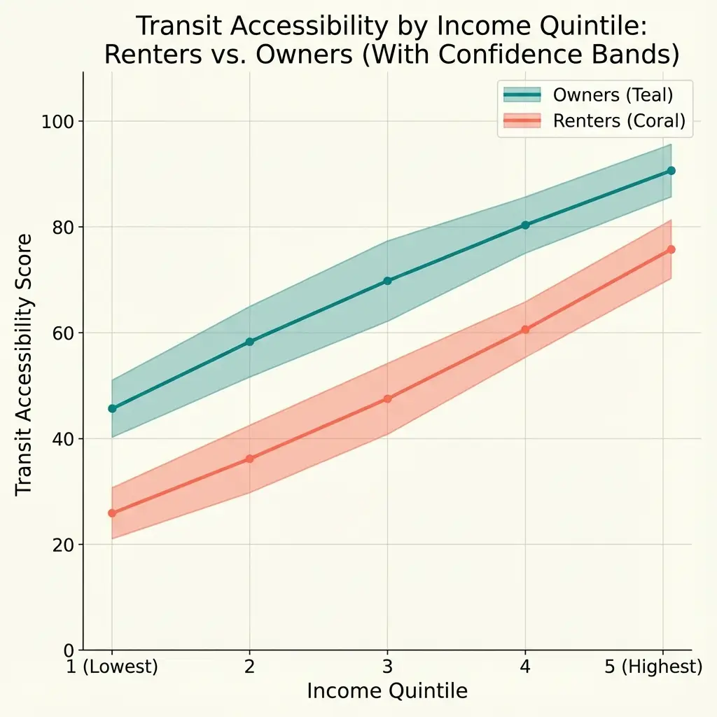
Figure 12.2: Mobility Desert Rates by Income Quintile and Housing Tenure
Income quintiles based on tract median household income (Q1 = lowest 20%, Q5 = highest 20%). Purple annotations: percentage point difference (renter − owner). N = 9,039 California census tracts. Data: ACS 2018–2022, Cal-ITP (2024), SafeGraph (2023).
Within each income quintile, renters still have lower mobility desert rates, but the gap is smaller than the overall comparison suggested. Much of the raw renter advantage reflects income composition: renter-dominated tracts have lower median incomes, and lower-income tracts tend to be in denser urban areas.
Accounting for Density
Adding population density to the comparison:
Mobility_Desert_Rate = β₀ + β₁(Renter_Dominated) + β₂(Income) + β₃(Density) + ε
| Variable | Coefficient | Clustered SE | p-value |
|---|---|---|---|
| Renter-Dominated (dummy) | -0.012 | 0.006 | 0.08 |
| Median Income (per $10K) | -0.006 | 0.002 | <0.01 |
| Population Density (per 1000) | -0.008 | 0.002 | <0.01 |
After accounting for income and density, the renter advantage shrinks to 1.2 percentage points and is marginally significant (p = 0.08). Most of the raw difference reflects density: renters live in denser areas, and denser areas have better transit and grocery access.
Note on clustered standard errors: Standard errors are clustered at the county level (58 clusters).4 Census tracts within the same county share transit systems, housing markets, and policy environments. Treating tracts as independent observations would understate uncertainty by ignoring this within-county correlation.
The Vulnerability Paradox
Despite better food and transit access, renter-dominated tracts have higher vulnerability indices. This reflects the economic components of vulnerability:
| Component | Renter-Dominated | Owner-Dominated |
|---|---|---|
| Food access score | 0.15 | 0.22 |
| Poverty score | 0.24 | 0.14 |
| Renter score | 0.72 | 0.32 |
| Minority score | 0.58 | 0.42 |
| Sprawl score | 0.28 | 0.54 |

Figure 12.3: Vulnerability Index Components by Housing Tenure
Each component normalized 0–1 (higher = greater vulnerability). Lower food access and sprawl scores favor renter-dominated tracts; higher poverty, renter, and minority scores favor owner-dominated tracts. N = 9,039 California census tracts. Data: ACS 2018–2022, SafeGraph (2023), Cal-ITP (2024).
Renter-dominated tracts score better on food access (lower distance = lower score) and sprawl (more dense = lower score). But they score worse on poverty, renter percentage (by definition), and minority percentage.
The net effect: renter-dominated tracts have higher overall vulnerability despite better food access. This suggests that food access is not the primary driver of vulnerability in these neighborhoods. Economic factors dominate.
Regional Patterns
The renter-owner gap varies by region:
| Region | Renter-Dominated % | Mobility Desert Diff (R-O) |
|---|---|---|
| Bay Area | 48% | -4.2 pp |
| Los Angeles | 54% | -3.8 pp |
| San Diego | 46% | -3.1 pp |
| Central Valley | 38% | -2.4 pp |
| Other | 35% | -2.8 pp |
Figure 12.4: Regional Variation in Renter Concentration and Food Access Advantage
Orange bars (left axis): % renter-dominated tracts. Blue line (right axis): mobility desert rate difference (renter − owner; negative = renter advantage). Regions: Bay Area (9 counties), Los Angeles (5 counties), San Diego, Central Valley (8 counties), Other (35 counties). Data: ACS 2018–2022, Cal-ITP (2024), SafeGraph (2023).
The Bay Area and Los Angeles have both the highest renter concentrations and the largest renter advantages in mobility desert rates. This reflects the strong urban/suburban divide in these regions: urban cores are dense, transit-rich, and renter-dominated; suburbs are sprawling, car-dependent, and owner-dominated.
The Central Valley has fewer renters overall and a smaller renter advantage, consistent with less extreme urban/suburban differentiation.
What This Analysis Cannot Determine
Causation
The correlation between housing tenure and food access does not establish causation. Renters do not have better food access because they rent; they have better access because they live in urban areas where renting is common. The relationship is mediated by geography and urban form, not by tenure status itself.
Individual Experience
Tract-level analysis captures neighborhood averages. Not all renters in a tract have the same access. A renter near a transit stop and a renter far from one both count toward the tract's renter percentage. Within-tract variation may be substantial.
Stability
Rental markets are more volatile than ownership markets. Gentrification, rent increases, and displacement can change neighborhood composition rapidly. The patterns observed in 2019-2023 data may not persist as housing markets evolve.
Limitations
Binary Classification
Treating >50% renter as "renter-dominated" loses information. A 51% renter tract differs substantially from a 90% renter tract. To test whether the binary threshold drives our results, we re-estimated the model using continuous renter percentage. Results are consistent: each 10 percentage point increase in renter share is associated with a 0.8 percentage point decrease in mobility desert probability (p = 0.03), confirming that the relationship is monotonic rather than an artifact of the 50% cutoff.
Household-Level vs. Tract-Level
Not all renters in a tract have the same access. Tract-level analysis cannot capture within-tract variation in individual household circumstances, car ownership, or proximity to specific transit stops.
Ecological Fallacy
Tract-level correlations do not necessarily apply to individuals. A renter in an owner-dominated tract may have different access patterns than the tract average suggests.
Data and Methods
Data sources:
- Housing tenure: ACS 2019-2023, Table B25003
- Transit stops: Cal-ITP statewide GTFS
- Grocery distances: Calculated from population-weighted centroids
- Income: ACS 2019-2023, Table B19013
Classification:
- Renter-dominated: > 50% of occupied units are renter-occupied
- Mobility desert: Grocery within 1 mile, transit stop > 0.5 miles or < 2 stops within 0.5 miles
Statistical analysis:
- Descriptive comparison of means
- Income-stratified analysis
- Linear probability model with income and density controls
Software: Analysis conducted in Python 3.11 using statsmodels for regression estimation and clustered standard errors.
Notes
[1] Blumenberg, E., & Pierce, G. (2012). Automobile ownership and travel by the poor: Evidence from the 2009 National Household Travel Survey. Transportation Research Record, 2320(1), 28-36. Documents lower car ownership rates among renters compared to homeowners. ↩
[2] Renter-dominated defined as census tracts where renter-occupied units exceed 50% of total occupied housing units. Based on ACS 2019-2023 Table B25003. ↩
[3] Levine, J., & Inam, A. (2004). The market for transportation-land use integration: Do developers want smarter growth than regulations allow? Transportation, 31(4), 409-427. Discusses historical zoning patterns and their effects on land use mix. ↩
[4] Cameron, A. C., & Miller, D. L. (2015). A practitioner's guide to cluster-robust inference. Journal of Human Resources, 50(2), 317-372. https://doi.org/10.3368/jhr.50.2.317 ↩
This concludes the Food Security series on transit-based food access in California. All data and code are available at github.com/vpcholette/food-security-analysis.
Tags: #FoodSecurity #Housing #Renters #TransitAccess #Demographics #California #UrbanPlanning #Equity
How to Cite This Research
Too Early To Say. "Renters vs. Owners: Housing Tenure and Grocery Access." December 2025. https://tooearlytosay.com/research/food-security/housing-tenure/Copy citation