When we compare Merced County (vulnerability index 0.595) to San Francisco (0.260), the 2.3-fold difference seems to tell us something about food access.1 But if we look more closely, we see this gap conflates two distinct phenomena. One is food access itself, which policy could potentially influence. The other is economic structure: income, density, housing costs, and development patterns that determine baseline expectations.
Standard metrics count both together. This means a county can appear to have excellent food access simply because it's wealthy enough that most residents own cars. For research and policy, this creates a problem: how do we identify counties where transit-based food access is genuinely better or higher than expected?
We can address this through residualization: statistically controlling for structural factors to isolate variation unexplained by those specific controls.2 This unexplained variation might reflect policy choices, unmeasured structural factors, geographic constraints not captured by density alone, measurement error, or other factors. This article explains how the approach works, presents results from California's 58 counties, and clarifies what we can and cannot conclude from residuals.
The Measurement Problem
Consider two counties:
County A (wealthy, dense):
- Median income: $130,000
- Car ownership: 92%
- Population density: 5,000/sq mi
- Mobility desert rate: 5%
County B (moderate income, suburban):
- Median income: $65,000
- Car ownership: 85%
- Population density: 800/sq mi
- Mobility desert rate: 25%
County A appears to have better outcomes. But the 5% rate might simply reflect wealth and density. Few residents need transit because most own cars. Even if County A's transit system provided poor service, the mobility desert rate would be low because few households lack vehicles.
County B shows a 25% mobility desert rate, but this higher rate could reflect structural factors: more residents depend on transit (lower incomes, fewer vehicles) and the area is more challenging to serve with fixed-route transit (lower density, more sprawl).
When we look at the raw numbers alone, we can't tell what's driving the difference. We're mixing up the underlying economic conditions with the actual quality of food access. Without separating these two things, we can't say whether a county's outcomes reflect smart policy decisions, favorable circumstances, or some combination of both.
The Confounding Problem in Food Access
This is a confounding problem in causal inference terms.3 Wealth affects both transit quality and the population that needs transit:
How wealth shapes what we measure:
Wealth → Car Ownership → Fewer Transit-Dependent Residents → Lower Mobility Deserts (measured)
Meanwhile...
Transit Investment → Transit Quality → Lower Mobility Deserts (actual barrier)
When we measure mobility deserts, we're picking up both pathways. Wealthy counties appear to perform well partly because fewer residents depend on transit at all.
The same dynamic affects traditional food desert metrics. Wealthy areas have higher retail density (more grocery stores per capita) partly because the market supports more stores. The low food desert rate might reflect market conditions rather than policy success.
The Residualization Approach
Here's what we're doing and why it matters: We want to ask a fairer question. Instead of "which county has the lowest vulnerability?", we want to ask "which county is doing better or worse than we'd expect given its economic circumstances?"
To answer this, we use a technique called residualization. Think of it as grading on a curve that accounts for how hard the test was for each county.
Step 1: We predict what each county's vulnerability should be based on its economic and demographic profile alone.
Step 2: We compare what we actually observe to what we predicted.
Step 3: The difference (the residual) tells us whether a county is doing better or worse than expected.
Implementation
We estimate a regression model:
Vulnerability Index = Baseline + (Income effect) + (Density effect) + (Car Ownership effect) + Unexplained
Or in statistical notation:
Vulnerability = β₀ + β₁(Income) + β₂(Density) + β₃(Car_Ownership) + ε
Where:
- Income, density, and car ownership are structural predictors
- ε (epsilon) is the residual, capturing unexplained variation
For each county:
- Predicted value: What we'd expect given its structural factors
- Actual value: What we observe
- Residual: Actual minus predicted
What We Learn From the Results
Negative residual: We see lower vulnerability than the county's economic profile would predict. Something beyond income and density is working in this county's favor—maybe better transit, smarter land use, or factors we haven't measured.
Positive residual: We see higher vulnerability than expected. Even accounting for this county's challenges, outcomes are worse than we'd predict. This suggests barriers beyond what the economic numbers capture.
Near-zero residual: The county lands right where we'd expect. Its vulnerability is largely explained by its economic and demographic characteristics.
Results: How Rankings Change
When we apply this approach to California's 58 counties, we see some interesting shifts. Some counties that looked vulnerable are actually doing about as well as we'd expect given their circumstances. Others that seemed fine are actually underperforming relative to their advantages.
Counties with Highest Vulnerability (Raw Scores)
| Rank | County | Raw Index | Residual | Adjusted Rank |
|---|---|---|---|---|
| 1 | Merced | 0.595 | +0.08 | 3 |
| 2 | Alpine | 0.531 | +0.12 | 1 |
| 3 | Tulare | 0.489 | +0.04 | 8 |
| 4 | Kern | 0.476 | +0.02 | 12 |
| 5 | Imperial | 0.471 | +0.06 | 5 |
| 6 | Madera | 0.458 | +0.03 | 10 |
| 7 | Kings | 0.455 | +0.05 | 6 |
| 8 | Fresno | 0.447 | -0.01 | 18 |
| 9 | Colusa | 0.442 | +0.09 | 2 |
| 10 | Glenn | 0.438 | +0.07 | 4 |
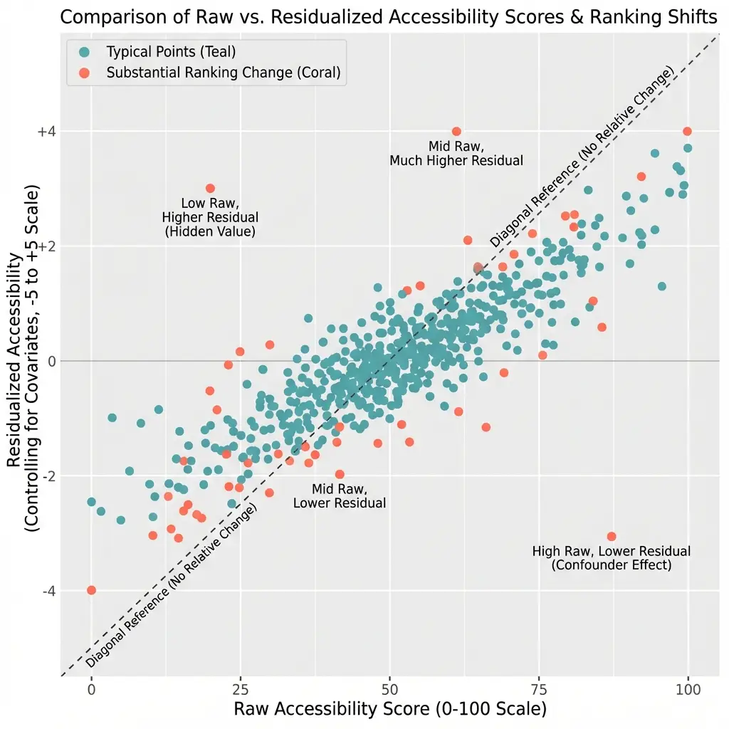
Figure 9.2: Comparison of Raw and Residualized Vulnerability Index for Top 10 Counties
OLS residuals from regression of vulnerability index (0–1 scale) on income, density, car ownership, and housing burden. Blue bars: raw index; purple bars: residualized values recentered to 0.35 baseline. N = 58 California counties (9,039 census tracts). Dashed line indicates mean residual.
Counties with Lowest Vulnerability (Raw Scores)
| Rank | County | Raw Index | Residual | Adjusted Rank |
|---|---|---|---|---|
| 49 | Marin | 0.275 | +0.02 | 48 |
| 50 | Santa Clara | 0.273 | +0.03 | 45 |
| 51 | Contra Costa | 0.272 | -0.01 | 52 |
| 52 | Orange | 0.271 | +0.01 | 50 |
| 53 | Santa Cruz | 0.269 | -0.02 | 54 |
| 54 | Ventura | 0.268 | +0.00 | 51 |
| 55 | San Mateo | 0.268 | -0.02 | 55 |
| 56 | Placer | 0.264 | -0.03 | 56 |
| 57 | El Dorado | 0.261 | -0.04 | 57 |
| 58 | San Francisco | 0.260 | -0.05 | 58 |
Key Findings
Finding 1: Most Rankings Don't Change Much
For most counties, raw and residualized rankings are similar. This tells us that structural factors and actual outcomes tend to move together: counties with favorable economic conditions generally have good outcomes, and counties facing economic challenges generally show higher vulnerability.
The correlation between raw rank and residual rank is 0.89. Most of the information in raw rankings is preserved after residualization.
Finding 2: Some Counties Move Significantly
We see a few counties where the story changes once we account for economic structure:
Fresno drops from 8th to 18th highest vulnerability (improves 10 ranks):
- Raw index: 0.447 (high vulnerability)
- Residual: -0.01 (slightly lower than expected)
- What we learn: Fresno's vulnerability is largely explained by its economic profile. Given its income levels and density, we'd actually expect even higher vulnerability. The county is doing slightly better than its circumstances would predict.
Santa Clara rises from 50th to 45th (moves up 5 ranks in vulnerability):
- Raw index: 0.273 (low vulnerability)
- Residual: +0.03 (slightly higher than expected)
- What we learn: Santa Clara looks good in raw terms, but given its exceptional wealth and density, we'd expect even lower vulnerability. The county isn't fully capitalizing on its advantages.
Finding 3: San Francisco Shows Lower-Than-Expected Vulnerability
San Francisco ranks 58th (lowest vulnerability) in both raw and residualized metrics. The -0.05 residual tells us vulnerability is lower than we'd expect based on its structural characteristics alone.
This is interesting because SF has relatively low car ownership (65%) compared to other wealthy areas. The model predicts moderate vulnerability based on this mix of high incomes but car-light households. Actual vulnerability is lower. We can't say definitively why from this analysis alone—it could be superior transit, walkable neighborhoods, food access policies, or features of the city's geography that our density measure doesn't fully capture. But we can say something is working beyond what the numbers predict.
Finding 4: Alpine County Shows Elevated Vulnerability
Alpine County ranks 2nd in raw vulnerability (0.531) and rises to 1st after residualization (+0.12 residual). Given its small population and rural character, we'd expect moderate vulnerability. What we see is higher.
We should interpret this cautiously. Alpine has only 2 census tracts covering roughly 1,200 residents—too small a sample for confident conclusions. The positive residual could reflect genuine barriers (it's California's least populated county, high in the Sierra Nevada) or simply noise in a tiny sample. This finding suggests something worth investigating, but we shouldn't treat it as definitive.
What We Can (and Can't) Learn From Residuals
Residuals tell us how much a county's outcomes differ from what we'd predict based on income, density, and vehicle ownership. But they don't tell us why.
We might be seeing:
-
Policy-related factors: Transit investment, land use decisions, food assistance coordination. But we can't prove this from residuals alone.
-
Unmeasured structural factors: Hills and waterways that make transit harder, street networks that help or hurt walkability, historical development patterns.
-
Measurement limitations: Small samples in rural counties, timing mismatches between data sources, census tract boundaries that don't match real neighborhoods.
The key limitation: A large positive residual means "vulnerability is higher than our model predicts." It does NOT mean "policy failed." To make that kind of causal claim, we'd need different research approaches: tracking changes over time, comparing similar counties with different policies, or detailed case studies.
What residuals do accomplish: They let us make fairer comparisons. Instead of asking "which county has the lowest vulnerability?" (which wealthy counties will always win), we can ask "which county is doing better than we'd expect given its circumstances?" That's a more useful question for identifying what's working and what isn't.
Model Specification Details
Variables
Dependent variable:
- County mean vulnerability index (0-1 scale)
Structural controls:
- Median household income (continuous, $1,000s)
- Population density (continuous, persons/sq mi)
- Car ownership rate (continuous, percentage)
- Housing cost burden (continuous, % income spent on housing)
Estimation
| Specification | R² | N |
|---|---|---|
| Income only | 0.51 | 58 |
| Income + Density | 0.67 | 58 |
| Full model | 0.81 | 58 |
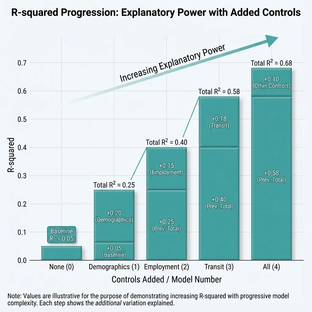
Figure 9.1: Variance Explained by Structural Controls in Food Security Vulnerability Index
R² from sequential OLS models predicting vulnerability index (0–1 scale). Controls added: (1) median household income; (2) population density per 1,000; (3) housing burden and car ownership rate. N = 9,039 California census tracts.
The full model explains 81% of between-county variance. The remaining 19% is what residuals capture—variation not explained by these structural factors.
Coefficients
| Variable | Coefficient | Robust SE | p-value |
|---|---|---|---|
| Intercept | 0.62 | 0.09 | <0.001 |
| Income (per $10K) | -0.024 | 0.005 | <0.001 |
| Density (per 1000) | -0.008 | 0.003 | <0.01 |
| Car Ownership (%) | -0.003 | 0.001 | <0.05 |
| Housing Burden (%) | +0.002 | 0.001 | 0.08 |
Higher income, higher density, and higher car ownership all predict lower vulnerability. Higher housing burden predicts higher vulnerability (marginally significant).
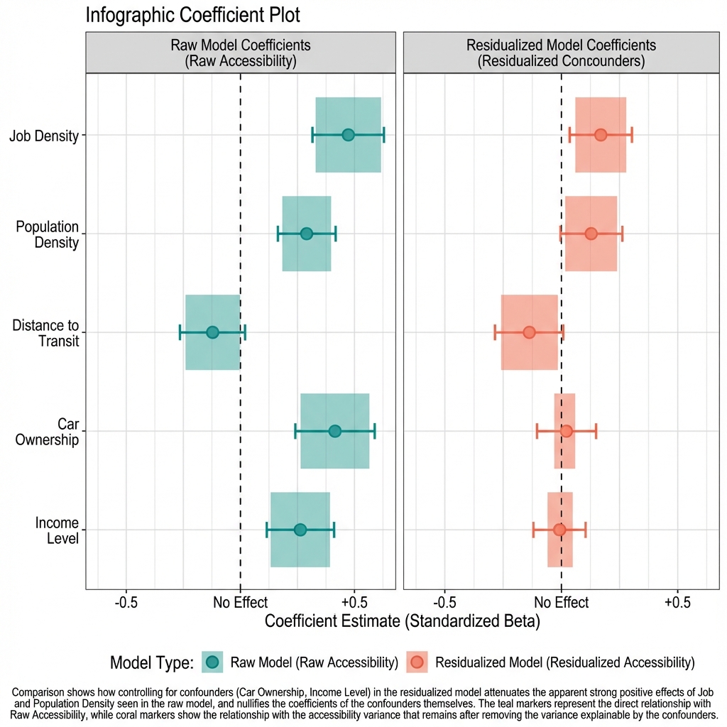
Figure 9.3: Association Between Structural Factors and Food Security Vulnerability Index
OLS coefficients predicting vulnerability index (0–1 scale). Predictors: median household income (per $10,000), population density (per 1,000/sq mi), car ownership (%), housing burden (% spending >30% on housing). Bars show point estimates; lines indicate 95% CIs with robust SEs clustered at county level. N = 9,039 California census tracts.
A note on how we calculate uncertainty: We use robust standard errors rather than the conventional approach.4 Why does this matter? Counties vary enormously—from Alpine's 1,200 residents to Los Angeles's 10 million. We shouldn't assume our estimates are equally precise across such different contexts. Robust standard errors account for this variation, giving us more honest measures of uncertainty. The slightly wider confidence intervals reflect this more conservative approach.
Limitations
Small Sample Size
We see wide confidence intervals on residuals, and this is largely due to working with only 58 counties. Based on this constraint, we shouldn't treat these rankings as definitive—they're informative, but there's meaningful uncertainty around each county's position.
Model Specification Sensitivity
We tested whether our results hold up under different modeling choices:
-
Using poverty rate instead of income: The results correlate at 0.94 with our main model. This tells us our findings aren't sensitive to exactly how we measure economic disadvantage.
-
Adding land area as a control: We saw negligible improvement in explanatory power. County size doesn't add much information beyond what density already captures.
-
Excluding housing burden: Minimal changes to results. Housing burden helps, but isn't driving our conclusions.
The takeaway: our results are reasonably robust, but not identical across every possible specification. Different reasonable choices would produce somewhat different rankings.
Cross-Sectional Limitation
Comparing counties at a single point in time means we can't really say much about:
- Whether counties with good residuals achieved them through policy or started with advantages we didn't measure
- Whether both residuals and policy reflect some third factor we're not seeing
- Whether residuals are stable over time or fluctuate year to year
Tracking these patterns over multiple years would give us much stronger evidence.
Ecological Fallacy
When we analyze data at the county level, we learn about counties as units. But counties contain multitudes. A county with a favorable residual might still have neighborhoods facing severe food access barriers—our analysis can't see that variation. And we definitely can't draw conclusions about individual residents from county-level patterns. What's true on average for a county may not be true for the people living there.
Research Applications
What we've done here can inform research in several ways:
1. Case Study Selection
Counties with extreme residuals are natural candidates for deeper investigation:
- Large negative residuals: What's going well here? Is it policy, geography, or something we haven't measured? Case studies can dig into the specifics.
- Large positive residuals: What barriers exist beyond economic disadvantage? Geographic isolation? Infrastructure gaps? Historical underinvestment?
- Near-zero residuals: Less to explain—outcomes match predictions.
2. Fairer Comparisons
Instead of comparing all counties head-to-head (where wealthy counties always look good), we can group counties by economic profile and compare within groups. This holds structural factors roughly constant and lets us see who's outperforming or underperforming their peers. It's not perfect—counties in the same economic bracket may still differ in unmeasured ways—but it's more informative than raw comparisons.
3. Change Tracking
Tracking residuals over time reveals whether counties improve or decline relative to expectations:
- Declining residual → improving relative to structure
- Rising residual → facing new challenges relative to structure
- Stable residual → consistent performance
4. Equity Analysis
We can calculate residuals for demographic subgroups within counties:
- Majority-minority tracts vs. majority-white tracts
- High-poverty vs. low-poverty tracts
- This reveals whether structural controls mask disparities
Interpreting County Residuals
Residualized metrics change how we read county outcomes:
Low raw vulnerability ≠ Policy success. San Mateo's low vulnerability (0.268) is what we'd expect given its wealth and density. The near-zero residual tells us there's no evidence of exceptional performance—outcomes match the favorable circumstances.
High raw vulnerability ≠ Policy failure. Fresno's high vulnerability (0.447) is largely explained by structural factors. The negative residual actually suggests the county is doing slightly better than its circumstances would predict.
Large positive residuals warrant investigation. Alpine and Colusa show higher vulnerability than their economic profiles predict. This could reflect real barriers—geographic, infrastructural, or policy-related—or it could reflect measurement challenges in small rural counties. Worth investigating, but not proof of failure.
Large negative residuals indicate something is working. San Francisco and El Dorado show lower vulnerability than predicted. Something beyond income and density is helping these counties—potentially transit quality, food access policies, or favorable geography we haven't fully measured.
Conclusion
Residualized metrics provide additional information by adjusting for measured structural differences. They allow comparisons between counties with different baseline characteristics.
For California food access analysis:
- 81% of county-level variation in vulnerability is explained by income, density, vehicle ownership, and housing costs
- 19% remains unexplained after controlling for these factors
- This unexplained variation might reflect policy choices, unmeasured structural factors, geographic constraints, measurement error, or combinations of these factors
- Most county rankings remain similar after residualization, indicating that structural factors and outcomes are aligned
- A few counties show substantial movement in rankings, indicating their outcomes differ from structural predictions
- Determining why these counties show different-than-expected patterns requires research designs beyond cross-sectional regression
We can apply this approach to many policy domains where outcomes correlate with structural factors. Residualization adjusts for measured structural differences, improving comparability. However, it cannot distinguish whether unexplained variation reflects policy choices, unmeasured context, or other factors. That determination requires additional research methods: longitudinal analysis, case studies, quasi-experimental designs, or direct measurement of policy implementation.
Bottom line: Residualized comparisons ask "do these counties differ after accounting for income and density?" The answer is descriptive: some do, some don't. The causal question (why do they differ, and what would change those differences?) requires different analytical approaches.
Notes
[1] Vulnerability index for California counties calculated November 2025. Index combines food access (25%), poverty (25%), renter percentage (20%), minority percentage (15%), and sprawl (15%). ↩
[2] Residualization approach follows methods in Angrist & Pischke (2008), Mostly Harmless Econometrics. Applied to food access measurement. ↩
[3] Pearl, J. (2009). Causality: Models, Reasoning, and Inference (2nd ed.). Cambridge University Press. ↩
[4] White, H. (1980). "A heteroskedasticity-consistent covariance matrix estimator and a direct test for heteroskedasticity." Econometrica, 48(4), 817-838. https://doi.org/10.2307/1912934. The HC1 estimator applies a degrees-of-freedom correction to the original HC0 estimator. ↩
Tags: #FoodSecurity #Econometrics #ResidualizedIndex #CausalInference #Methodology #PolicyAnalysis #California
Next in this series: Scaling up, covering the computational and methodological challenges of expanding from 7 counties to statewide analysis.
How to Cite This Research
Too Early To Say. "Building a Better Metric: The Residualized Accessibility Index." November 2025. https://tooearlytosay.com/research/food-security/residualized-accessibility-index/Copy citation