What County Comparisons Teach Us About Measurement
If we want to understand food access across California, we might start by comparing counties. When we apply identical methodology to all 58 counties, the results vary dramatically: the most vulnerable county (Merced, vulnerability index 0.595) scores 2.3 times higher than the least vulnerable (San Francisco, 0.260).1 Mobility desert rates range from under 5% to over 40%.
But this variation raises a question we need to take seriously: Are we measuring differences in food access, or differences in something else entirely?
High vulnerability scores identify where residents face substantial barriers, regardless of what causes those barriers—these counties still need intervention.
When we examine what drives county-level variation, we find that structural factors explain most of the difference: income, geography, population density, and development patterns. This doesn't mean food access policy doesn't matter. It means raw county comparisons confound policy with context, making it difficult to identify genuine differences in outcomes. Here's what we see when we look more closely.
The Statewide Picture
Our master analysis covers 9,039 residential census tracts across all 58 California counties.2 At the state level:
| Metric | Value |
|---|---|
| Mean vulnerability index | 0.318 |
| Median vulnerability index | 0.308 |
| Standard deviation | 0.084 |
| Range | 0.119 - 0.797 |
The vulnerability index combines five components: food access (25%), poverty rate (25%), renter percentage (20%), minority percentage (15%), and sprawl index (15%). Each is normalized 0-1, with higher scores indicating greater vulnerability.
Vulnerability Distribution
| Level | Tracts | Percentage |
|---|---|---|
| Low (0-0.25) | 1,826 | 20.2% |
| Moderate (0.25-0.50) | 6,916 | 76.5% |
| High (0.50-0.75) | 294 | 3.3% |
| Very High (0.75-1.0) | 3 | 0.03% |
Most California tracts fall in the moderate vulnerability range. Extreme vulnerability is rare, concentrated in a handful of tracts with compounding disadvantage across multiple dimensions.
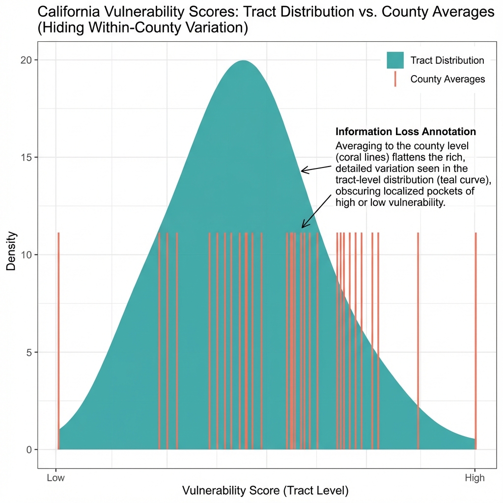
Figure 8.4: Frequency Distribution of Food Security Vulnerability Index Across California Census Tracts
Histogram of tract-level vulnerability index (0–1 scale). Categories: low (<0.25, 20.2%), moderate (0.25–0.50, 76.5%), high (>0.50, 3.3%). Red line = mean (0.318). N = 9,039 California census tracts. Index: PCA of income (reversed), vehicle unavailability, grocery distance, transit density, SNAP rate.
County Rankings: Top and Bottom
The 10 most vulnerable counties:
| Rank | County | Vulnerability Index | Food Desert % |
|---|---|---|---|
| 1 | Merced | 0.595 | 28.4% |
| 2 | Alpine | 0.531 | 50.0% |
| 3 | Tulare | 0.489 | 31.2% |
| 4 | Kern | 0.476 | 27.8% |
| 5 | Imperial | 0.471 | 33.3% |
| 6 | Madera | 0.458 | 25.0% |
| 7 | Kings | 0.455 | 35.7% |
| 8 | Fresno | 0.447 | 22.1% |
| 9 | Colusa | 0.442 | 40.0% |
| 10 | Glenn | 0.438 | 37.5% |
The 10 least vulnerable counties:
| Rank | County | Vulnerability Index | Food Desert % |
|---|---|---|---|
| 49 | Marin | 0.275 | 8.3% |
| 50 | Santa Clara | 0.273 | 5.2% |
| 51 | Contra Costa | 0.272 | 11.4% |
| 52 | Orange | 0.271 | 9.8% |
| 53 | Santa Cruz | 0.269 | 12.5% |
| 54 | Ventura | 0.268 | 10.2% |
| 55 | San Mateo | 0.268 | 4.7% |
| 56 | Placer | 0.264 | 14.3% |
| 57 | El Dorado | 0.261 | 18.8% |
| 58 | San Francisco | 0.260 | 2.1% |
Figure 8.3: California Counties Ranked by Mean Food Security Vulnerability Index
Population-weighted county means of tract-level vulnerability index (0–1 scale). Left: 10 most vulnerable counties; right: 10 least vulnerable. N = 58 California counties. Data: ACS 2018–2022, USDA Food Access Research Atlas (2020), Cal-ITP (2024).
What Explains the Variation?
The most vulnerable counties cluster in the Central Valley: Merced, Tulare, Kern, Fresno, Kings. The least vulnerable are Bay Area and coastal counties: San Francisco, San Mateo, Santa Clara, Marin.
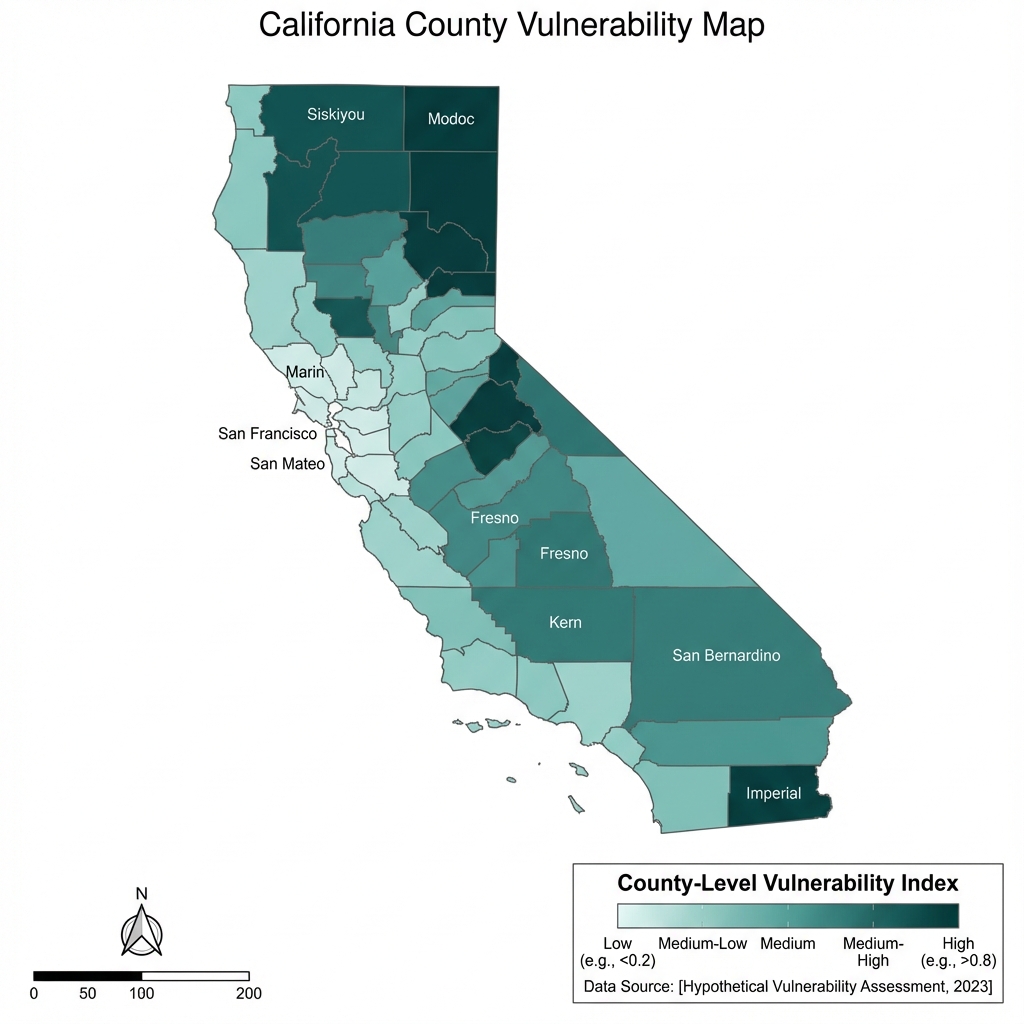
Figure 8.1: Mean Food Security Vulnerability Index Across California Counties
Choropleth of county-level vulnerability index (0–1 scale; higher = greater vulnerability). Color scale: light yellow (low) to dark blue (high). N = 58 California counties. Data: ACS 2018–2022, USDA Food Access Research Atlas (2020), Cal-ITP (2024).
This geographic pattern suggests structural factors drive much of the variation.
Factor 1: Income and Poverty
Central Valley counties have lower median incomes and higher poverty rates:
| Region | Median Income | Poverty Rate |
|---|---|---|
| Central Valley counties | $58,000 | 18.2% |
| Bay Area counties | $115,000 | 8.4% |
Income correlates strongly with vulnerability (r = -0.71). Counties with higher incomes have lower vulnerability scores almost mechanically, because poverty is 25% of the index.
Factor 2: Geography and Sprawl
Central Valley counties have lower population density and more sprawling development:
| Region | Median Pop Density | Sprawl Index |
|---|---|---|
| Central Valley | 120/sq mi | 8.4 |
| Bay Area | 2,400/sq mi | 1.2 |
Sprawl affects transit viability. Lower-density areas are harder to serve with fixed-route transit. The sprawl component (15% of the index) penalizes rural and suburban counties relative to urban ones.
Factor 3: Retail Distribution
Grocery store density per capita varies by county development patterns. Rural counties have fewer stores per capita, and those stores are more dispersed. The food access component (25% of the index) captures this directly.
Factor 4: Demographics
Minority percentage and renter rate also correlate with county wealth. Coastal counties tend to have lower poverty rates, higher homeownership, and (in some cases) less demographic diversity. These factors account for 35% of the index.
The Interpretation Challenge
When structural factors explain most variation, raw county rankings have limited policy value. Consider what the Merced vs. San Francisco comparison actually reveals:
| Metric | Merced | San Francisco |
|---|---|---|
| Vulnerability index | 0.595 | 0.260 |
| Median income | $52,000 | $119,136 |
| Population density | 155/sq mi | 18,600/sq mi |
| Car ownership | 91% | 65% |
Merced's high score reflects the reality that its residents face genuine food access challenges that require targeted solutions appropriate to a rural agricultural economy. San Francisco's low score reflects wealth, density, and urban form more than food-specific policy successes. Notably, within-county inequality in San Francisco means Tenderloin residents face barriers as severe as anywhere in the Central Valley.
Comparing these counties as if the difference represents the effects of food access policy conflates outcomes with structural context that determines baseline expectations.
Improving Cross-County Comparisons
Cross-county comparisons require accounting for structural factors. Several approaches can improve validity:
1. Compare Similar Counties
Grouping counties by structural characteristics allows more meaningful comparison:
Rural Central Valley: Merced, Madera, Kings, Fresno, Tulare
- Compare vulnerability within this peer group
- Variation here more likely reflects local factors
Figure 8.2: Census Tract Food Access Classifications in Central Valley Counties with Highest Vulnerability Scores
Detail of six Central Valley counties (Merced, Madera, Fresno, Tulare, Kings, Kern). Classification: Full Access (blue), Traditional Food Desert (gold), Mobility Desert (purple). Data: ACS 2018–2022, USDA Food Access Research Atlas (2020), Cal-ITP (2024).
Bay Area suburban: Alameda, Contra Costa, Santa Clara
- Different baseline expectations than Central Valley
- Compare to similar suburban regions elsewhere
2. Use Residualized Metrics
Statistical adjustment can isolate variation unexplained by structural factors:
Residual = Actual vulnerability - Predicted vulnerability (from income, density, etc.)
Counties with positive residuals show higher vulnerability than their structural factors predict. Counties with negative residuals show lower vulnerability than their structural factors predict.
This approach separates "given your income and density, how are you doing?" from "how wealthy and dense are you?"
3. Track Within-County Variation
County averages mask substantial within-county heterogeneity. Los Angeles County contains tracts ranging from 0.15 to 0.72 on the vulnerability index. The county average (0.38) describes neither the wealthy Westside nor South LA accurately.
Tract-level analysis within counties often reveals more actionable patterns than county-to-county comparison.
4. Focus on Change Over Time
Comparing the same county to itself at different time points controls for stable structural factors. If Merced's vulnerability index changes from 0.59 to 0.55 over five years, that reflects something that changed, not just baseline poverty.
Longitudinal analysis provides stronger inference about policy effects than cross-sectional comparison.
What Raw Rankings Do Tell Us
Despite the interpretation challenges, county rankings provide useful information:
They identify where vulnerable populations concentrate. Regardless of what factors drive Merced's high vulnerability score, residents in high-vulnerability counties face measurable barriers. Funding formulas that direct resources to high-vulnerability counties target areas where need is concentrated, even though the causes of that vulnerability cannot be determined from these comparisons.
They reveal regional patterns. The Central Valley cluster shows that counties in this region share characteristics associated with higher vulnerability scores. This geographic clustering is consistent with regional factors (agricultural economy, historical development patterns, transportation infrastructure) affecting multiple counties, though cross-sectional data cannot establish whether these factors cause the observed vulnerability patterns.
They provide benchmarks for tracking change. A county can monitor whether its vulnerability score changes over time relative to similar counties. While cross-sectional levels are difficult to interpret causally, within-county changes over time may provide stronger signals about whether conditions are improving, particularly when combined with information about policy or economic changes during the same period.
They identify candidates for deeper investigation. Counties that show vulnerability levels substantially different from what their structural factors predict are candidates for case study research to understand what unmeasured factors distinguish them. Such research requires additional data and methods beyond cross-sectional comparison.
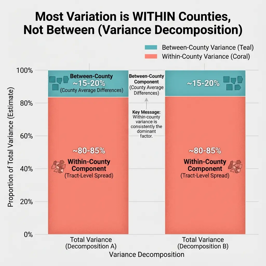
The Aggregation Problem
County-level analysis has a deeper problem: aggregation obscures tract-level variation. This is related to the "ecological fallacy" in social science research, where relationships observed at the aggregate level may not hold at the individual level.3
Consider two hypothetical counties, each with 100 tracts:
County A: All tracts have vulnerability index 0.35
- County average: 0.35
- Gini coefficient: 0 (perfect equality)
County B: 50 tracts at 0.20, 50 tracts at 0.50
- County average: 0.35
- Gini coefficient: 0.43 (substantial inequality)
Both counties have identical average vulnerability. But County B has high-vulnerability tracts that need intervention and low-vulnerability tracts that don't. County A's moderate vulnerability is distributed evenly.
Reporting only county averages would treat these counties identically. They require different approaches: County A might benefit from universal programs; County B needs targeted intervention in specific neighborhoods.
Within-County Variation in California
Calculating within-county Gini coefficients for vulnerability reveals substantial variation:
| County | Mean Vulnerability | Gini Coefficient |
|---|---|---|
| Los Angeles | 0.38 | 0.24 |
| San Diego | 0.34 | 0.19 |
| San Francisco | 0.26 | 0.11 |
| Fresno | 0.44 | 0.18 |
Los Angeles has the highest within-county inequality: some neighborhoods at 0.15, others at 0.72. San Francisco has low inequality: most tracts cluster near the county mean.
For Los Angeles, the county average is a poor summary statistic. For San Francisco, it's reasonably representative.
Cost-of-Living Sensitivity Analysis
One reasonable objection to cross-county comparisons: shouldn't we adjust for differences in cost of living? A dollar goes further in Merced than in San Francisco. Perhaps vulnerability rankings would change substantially if we accounted for regional price differences.
To test this, we merged 2023 Regional Price Parities (RPP) from the Bureau of Economic Analysis with our county-level vulnerability scores.4 RPP measures local prices relative to the national average (100 = national average). In California, values range from 98.4 (Kings County/Hanford-Corcoran metro) to 118.2 (San Francisco Bay Area counties).
We applied a partial adjustment that scales the income-sensitive portion of vulnerability by regional price levels:
Adjusted vulnerability = Original × (0.75 + 0.25 × county_RPP / state_avg_RPP)
This assumes approximately 25% of our index (the poverty rate component) should be price-adjusted, while the other components (food access distance, transit availability, demographics) reflect physical realities largely independent of local prices.
The result: minimal impact on rankings.
| Metric | Value |
|---|---|
| Maximum rank change | 3 positions |
| Counties unchanged | 28 of 58 (48%) |
| Correlation (original vs. adjusted) | 0.998 |
Merced remains the most vulnerable county. San Francisco remains the least vulnerable. The three counties with the largest rank changes (Imperial, Tulare, Kings) each shifted by only 3 positions.
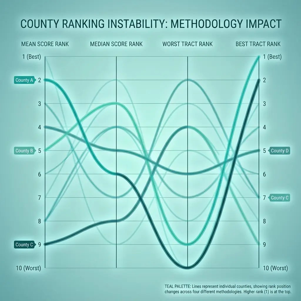
Figure 8.5: California County Rankings Before and After Cost-of-Living Adjustment
Left: original vs. cost-adjusted vulnerability ranks (diagonal = no change). Right: distribution of rank changes (48% unchanged, 36% ±1, 16% ±2–3). Rank correlation = 0.998. N = 58 California counties. Data: BEA Regional Price Parities (2023), ACS 2018–2022.
Why doesn't cost-of-living adjustment matter more? Our composite index already captures much of what cost-of-living reflects. Counties with high living costs tend to have higher incomes, higher car ownership, better transit, and denser grocery store coverage. Counties with low living costs tend to have lower incomes and the structural characteristics that correlate with vulnerability. The correlation is already baked into the underlying components.
This finding doesn't mean cost-of-living adjustments never matter. When comparing across states with dramatically different price levels—say, rural Mississippi (RPP ~85) versus coastal California (RPP ~118)—the adjustment could shift rankings substantially. Within a single state, the variation is narrower and largely collinear with other factors the index captures.
For a deeper treatment of when cost-of-living adjustments matter for food security measurement, see our separate analysis: When Cost-of-Living Adjustments Don't Matter (And When They Do).
Policy Implications
These findings suggest we should consider several things when thinking about policy responses to county-level food access data:
This analysis argues for smarter targeting of resources, not less investment. High-vulnerability counties need more support, not less—but that support should be designed for their specific structural context. Knowing that Merced's challenges stem from geography and income distribution helps target solutions that are economically viable: mobile markets, demand-responsive transit, SNAP outreach.
Interpret county rankings as reflecting structure, not policy effects. Raw rankings reflect income, density, and demographics as much as food access patterns. Cross-sectional county comparisons cannot distinguish whether observed differences result from policy choices, structural constraints, or unmeasured factors. Counties with high vulnerability scores have populations facing genuine barriers, but the causes of those barriers cannot be determined from these comparisons.
Use county data for resource allocation, not causal attribution. Directing resources to high-vulnerability counties targets areas where need is concentrated. The data identifies where vulnerable populations live; it cannot determine whether county-level policies caused or could change these patterns.
Look within counties for variation in similar structural contexts. The tracts in south Los Angeles that score 0.65 on vulnerability differ from tracts in Santa Monica at 0.18 on multiple dimensions. County averages obscure this heterogeneity. Tract-level analysis allows comparisons within more similar contexts, though even tract-level cross-sectional comparisons face the same fundamental challenge: distinguishing correlation from causation requires additional research designs.
Track change over time for stronger inference. A county that reduces its vulnerability index by 0.05 over time shows improvement in measured outcomes. Within-county changes over time provide stronger evidence about relationships than static cross-county comparisons, though even longitudinal analysis cannot definitively establish that policy changes caused observed trends without additional identification strategies.
Limitations
Index construction choices matter. The weights (25/25/20/15/15) are defensible but not unique. Different weights would change rankings.
Structural factors are imperfectly measured. Income, density, and sprawl capture some structural variation but not all. Unmeasured factors (political culture, historical investment patterns, geographic constraints) also matter.
County boundaries are arbitrary. Census tracts near county borders may have more in common with neighboring tracts in other counties than with distant tracts in the same county.
Cross-sectional data can't establish causation. We observe correlation between structure and vulnerability. We cannot determine from this data whether changing structural factors would change vulnerability.
Data and Methods
Data sources:
- Grocery distances: Calculated from population-weighted tract centroids
- Demographics: ACS 2019-2023 5-year estimates
- Sprawl metrics: Calculated from tract area and population
Vulnerability index components:
| Component | Weight | Source |
|---|---|---|
| Food access (distance) | 25% | Grocery distance analysis |
| Poverty rate | 25% | ACS Table S1701 |
| Renter percentage | 20% | ACS Table B25003 |
| Minority percentage | 15% | ACS Table B03002 |
| Sprawl index | 15% | Calculated (area/population) |
County rankings: Based on mean tract-level vulnerability index within each county.
Notes
[1] Vulnerability index calculated for 9,039 California census tracts with residential populations (density > 100/sq mi, population > 500). Index ranges 0-1, with higher values indicating greater vulnerability. ↩
[2] Master analysis conducted November 2025. Data sources: ACS 2019-2023, grocery store locations from Google Places API and USDA SNAP retailer database, Cal-ITP transit data. ↩
[3] Robinson, W. S. (1950). "Ecological correlations and the behavior of individuals." American Sociological Review, 15(3), 351-357. https://doi.org/10.2307/2087176. Classic paper on the ecological fallacy and interpretation of aggregate-level data. ↩
[4] Bureau of Economic Analysis. (2024). "Regional Price Parities by Metropolitan Statistical Area." Table MARPP. https://www.bea.gov/data/prices-inflation/regional-price-parities-state-and-metro-area. RPP measures relative price levels for all goods and services consumed, with 100 representing the national average. Non-metro California counties assigned state average RPP (112.6). ↩
Tags: #FoodSecurity #California #CountyAnalysis #VulnerabilityIndex #SpatialAnalysis #Methodology #Comparison
Next in this series: Building a better metric—the residualized accessibility index that separates structural factors from policy-attributable variation.
How to Cite This Research
Too Early To Say. "Why County Rankings Confound Policy with Context." November 2025. https://tooearlytosay.com/research/food-security/county-comparison-methods/Copy citation