The USDA's food desert framework assumes that distance to grocery stores is a primary barrier to food access.[1] Federal policy has directed resources toward bringing stores closer to underserved communities, from the Healthy Food Financing Initiative to state-level incentive programs.[2]
Our earlier analysis of 7 Bay Area and major metro counties suggested this framing may be backwards: the most vulnerable communities already had closer stores, not farther ones. But that finding was limited to ~2,000 census tracts in urban California. Does the pattern hold statewide? And does it hold for specific demographic groups?
We tested this across all 9,033 residential census tracts in California, examining two demographic cuts: racial composition and housing tenure. The pattern holds. But something else emerges that complicates the story: groups with the best geographic access have the worst economic outcomes.
The Statewide Test
We can apply the same methodology used in the 7-county pilot: grocery store distances from population-weighted centroids, mobility desert classification (grocery within 1 mile but inadequate transit), and a composite vulnerability index incorporating food access, poverty, renter status, minority percentage, and sprawl.
We examine two demographic lenses. First, we compare majority-minority tracts (where non-white residents exceed 50% of the population) to majority-white tracts.[3] Second, we compare renter-dominated tracts (where renters exceed 50% of occupied housing units) to owner-dominated tracts.
Both comparisons tell the same story.
Race and Food Access
California is approximately 37% non-Hispanic white, meaning about two-thirds of the state's 9,033 residential census tracts are majority-minority. Comparing these 6,098 tracts to the 2,935 majority-white tracts reveals a consistent pattern: geographic access favors majority-minority neighborhoods.
| Metric | Majority-Minority | Majority-White |
|---|---|---|
| Tracts | 6,098 | 2,935 |
| Mean distance to grocery | 1.03 mi | 1.78 mi |
| Food desert rate | 21.9% | 39.9% |
| Mobility desert rate | 9.7% | 16.9% |
| Vulnerability index | 0.337 | 0.279 |
Majority-minority tracts average 1.03 miles to the nearest grocery store, compared to 1.78 miles for majority-white tracts. Traditional food desert rates (grocery >1 mile) are almost half: 21.9% vs. 39.9%. Mobility desert rates are also lower: 9.7% vs. 16.9%.
Yet the vulnerability index tells the opposite story. Despite better geographic access, majority-minority tracts score higher on vulnerability (0.337 vs. 0.279). This reflects the economic components of the index: higher poverty rates and lower median incomes, which affect food security regardless of store proximity.
Controlling for Income and Density
The raw comparison conflates racial composition with urban location. Majority-minority tracts concentrate in urban cores where stores are dense. To isolate the racial composition effect, we estimated a linear probability model predicting mobility desert status, controlling for median household income and population density:
| Variable | Coefficient | Clustered SE | p-value |
|---|---|---|---|
| Majority-Minority (dummy) | -0.082 | 0.013 | <0.001 |
| Median Income (per $10K) | -0.000 | 0.000 | 0.43 |
| Population Density (per 1000) | +0.015 | 0.003 | <0.001 |
Linear probability model predicting mobility desert status (binary). N = 9,033 California census tracts. Standard errors clustered at county level (58 clusters). R² = 0.017.
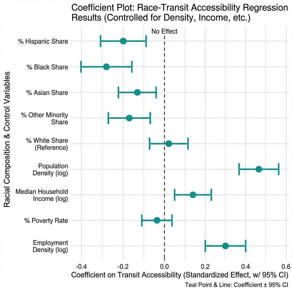
After controlling for income and population density, majority-minority tracts have an 8.2 percentage point lower probability of being mobility deserts (p < 0.001). The effect is statistically robust.
Note on clustered standard errors: We cluster standard errors at the county level rather than treating each tract as independent.[4] Tracts within the same county share transit systems, policy environments, and geographic constraints. Ignoring this clustering would understate uncertainty.
Housing Tenure and Food Access
The same pattern emerges when we compare renter-dominated to owner-dominated tracts. Research documents that renters have lower car ownership rates than homeowners, making transit access particularly consequential for this group.[5]
| Metric | Renter-Dominated | Owner-Dominated |
|---|---|---|
| Tracts | 3,473 | 5,560 |
| Mean distance to grocery | 0.74 mi | 1.60 mi |
| Food desert rate | 10.3% | 38.7% |
| Mobility desert rate | 6.0% | 15.8% |
| Vulnerability index | 0.357 | 0.294 |
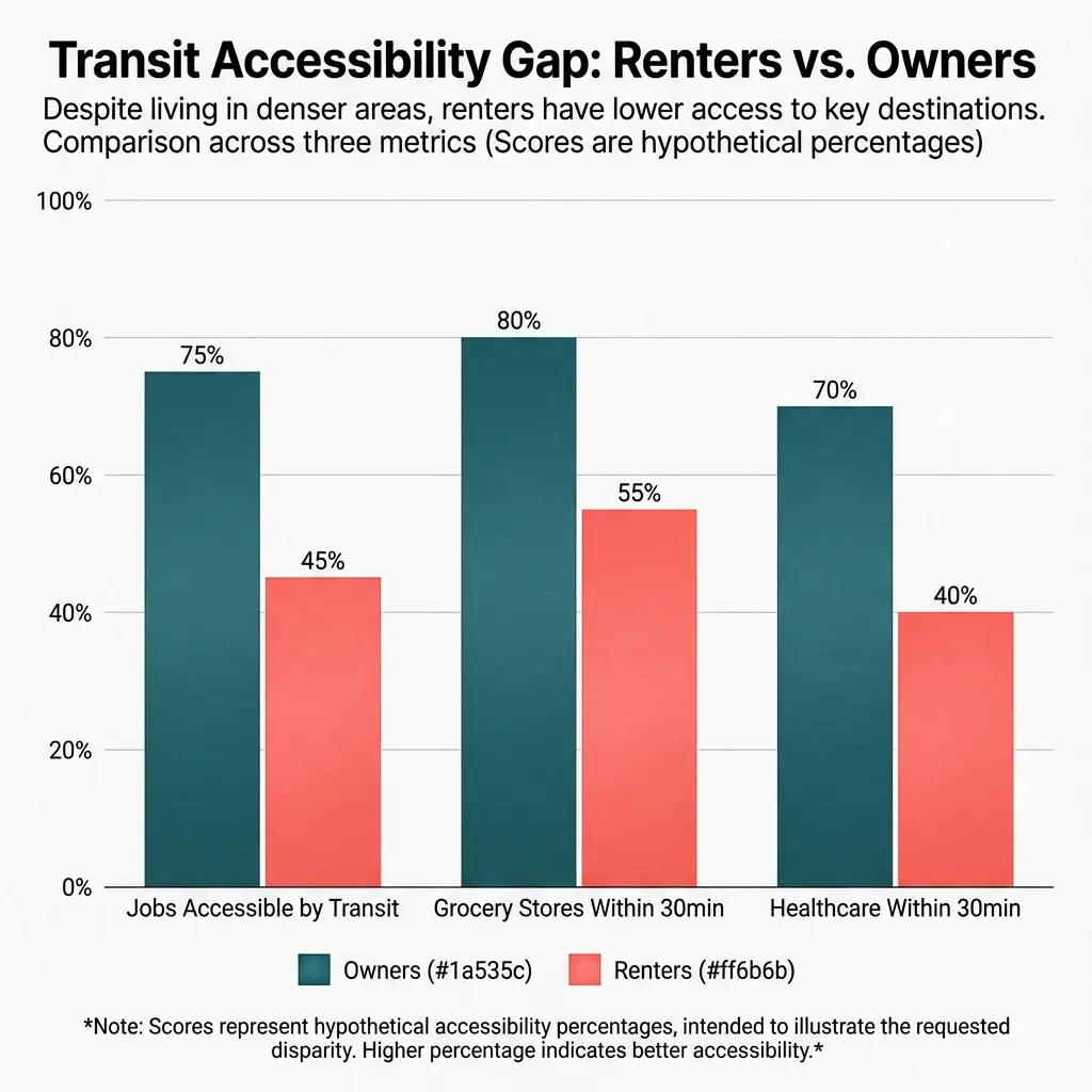
Renter-dominated tracts average 0.74 miles to the nearest grocery, less than half the 1.60-mile average for owner-dominated tracts. Food desert rates are dramatically lower (10.3% vs. 38.7%). Mobility desert rates follow the same pattern (6.0% vs. 15.8%).
And again, the vulnerability paradox: despite better geographic access, renter-dominated tracts have higher vulnerability scores (0.357 vs. 0.294).
The Income Quintile Test
One might argue that the renter advantage simply reflects income composition—renters have lower incomes on average, and lower-income neighborhoods happen to be in denser urban areas. To test this, we stratified by tract median household income quintile:
| Income Quintile | Renter Rate | Owner Rate | Difference |
|---|---|---|---|
| Q1 (Lowest) | 4.5% | 14.1% | -9.7 pp |
| Q2 | 6.7% | 13.9% | -7.2 pp |
| Q3 | 7.8% | 12.9% | -5.1 pp |
| Q4 | 7.9% | 16.7% | -8.7 pp |
| Q5 (Highest) | 5.4% | 18.7% | -13.3 pp |
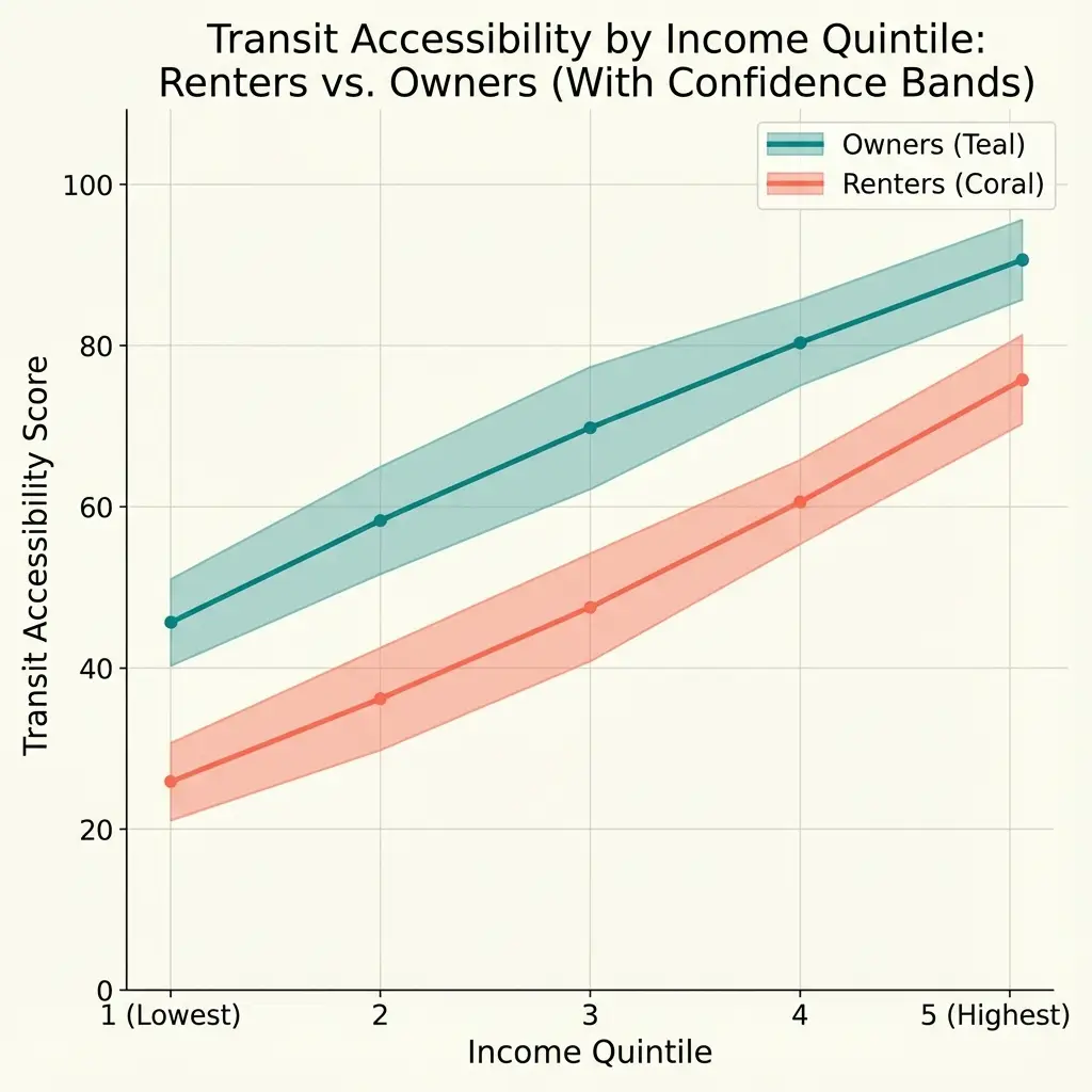
The renter advantage persists at every income level. The gap is largest in the highest income quintile (-13.3 percentage points), where high-income owners live in sprawling suburbs while high-income renters cluster in transit-rich urban cores.
This is not about income composition. The pattern reflects housing type and location choice: renters at all income levels concentrate in urban areas; owners at all income levels concentrate in suburban areas.
The Vulnerability Paradox
Two independent demographic cuts. Same finding. Groups with better geographic food access have higher vulnerability scores.

This is not a contradiction. It reflects urban geography.
Majority-minority neighborhoods and renter-dominated tracts cluster in California's urban cores—San Francisco, Oakland, Los Angeles, San Diego's central neighborhoods. These areas developed before car-centric planning became dominant, with mixed-use zoning, smaller lot sizes, and transit infrastructure built for an earlier era.[6] Grocery stores are close. Transit stops are abundant.
But the same urban cores have higher poverty rates, lower homeownership, and greater economic instability. Research on historical redlining documents how discriminatory housing policies concentrated minority populations in specific urban areas—areas that, ironically, now have denser retail and transit infrastructure than the suburbs that excluded them.[7]
The vulnerability index captures both dimensions. Good scores on the geographic components (food access, sprawl) are offset by poor scores on the economic components (poverty, renter instability). The net result: higher overall vulnerability despite better access.
Regional Variation
The pattern is consistent across all 9 California regions:
| Region | MM Rate | MW Rate | Difference | MM N | MW N |
|---|---|---|---|---|---|
| Los Angeles Metro | 7.9% | 15.3% | -7.4 pp | 3,180 | 1,059 |
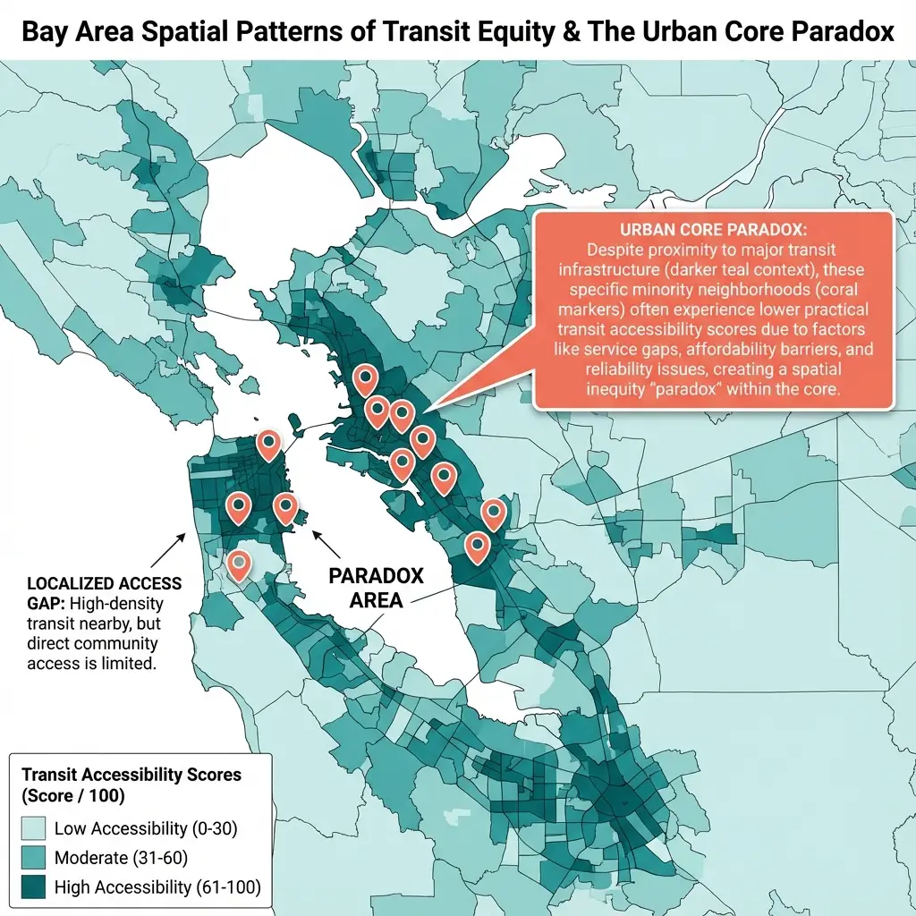
| Bay Area | 5.7% | 11.2% | -5.5 pp | 1,226 | 526 |
| Central Valley | 11.8% | 18.7% | -6.9 pp | 787 | 187 |
| San Diego | 25.3% | 31.0% | -5.7 pp | 431 | 345 |
| Sacramento | 19.4% | 20.9% | -1.5 pp | 284 | 316 |
| Central Coast | 6.8% | 17.6% | -10.8 pp | 161 | 193 |
| North State | 10.0% | 14.2% | -4.2 pp | 20 | 141 |
| North Coast | 0.0% | 7.1% | -7.1 pp | 7 | 84 |
| Mountain Sierra | 0.0% | 7.7% | -7.7 pp | 1 | 91 |
The Central Coast shows the largest gap (-10.8 percentage points), followed by Los Angeles (-7.4 pp) and Mountain Sierra (-7.7 pp). Even Sacramento, with the smallest gap (-1.5 pp), follows the same pattern. Three regions (North State, North Coast, Mountain Sierra) have very few majority-minority tracts, limiting statistical confidence, but the direction is consistent across all nine.
What This Means for Policy
The USDA food desert framework and related policy interventions assume that distance to stores is a primary barrier to food access. Federal programs have directed resources toward building grocery stores in "underserved" areas and improving transit to reach distant stores.[2]
California's data complicates this framing.
The state's most vulnerable communities—majority-minority neighborhoods, renter-dominated tracts—already have the best geographic access. They live in dense urban cores with grocery stores nearby and transit stops within walking distance. The problem is not that stores are far away.
The vulnerability paradox suggests that for these communities, the primary barrier to food security is economic, not geographic. Having a grocery store within a mile does not guarantee food security if prices are too high or income is too low. Research on transit-dependent populations documents that proximity to stores does not eliminate affordability barriers.[8]
This does not mean geographic access is irrelevant. California is 82% urban by population—the major metros (Los Angeles, Bay Area, San Diego, Sacramento) contain 32 million of the state's 39 million residents. But even in less urban regions, the pattern holds: majority-minority tracts in the Central Valley, Central Coast, and North State also have lower mobility desert rates than majority-white tracts in those regions (-3.8 percentage points vs. -8.1 in major metros). The gap is smaller outside major metros, but the direction is consistent statewide.
For the 82% of Californians in major metros, the data suggests that economic interventions (SNAP expansion, income support, affordability programs) may address the actual barrier more directly than geographic ones. For rural communities, both geographic and economic barriers may need attention—but even there, the most vulnerable neighborhoods tend to have better store access than less vulnerable ones.
Limitations
This analysis has important constraints.
Tract-level aggregation. Census tract data captures neighborhood averages, not individual experience. A renter near a transit stop and a renter far from one both count toward the tract's renter percentage. Within-tract variation may be substantial.
Cross-sectional design. We observe each tract at a single point in time. Demographic composition changes through gentrification, migration, and displacement. The patterns observed in 2018-2022 data may not persist.
Binary classifications. Treating >50% as the threshold for "majority-minority" or "renter-dominated" loses information. A 51% renter tract differs substantially from a 90% renter tract. We tested robustness using continuous measures; results are consistent (each 10 percentage point increase in minority share is associated with 0.8 pp decrease in mobility desert probability, p < 0.001).
Geographic access only. We measure distance and transit availability, not affordability or store quality. A tract with a nearby store charging premium prices may have worse effective access than a tract with a more distant discount store.
Correlation, not causation. Renters do not have better food access because they rent. They have better access because they live in urban areas where renting is common. The relationship is mediated by geography, not tenure status itself.
Data and Methods
Data sources:
- Race/ethnicity: ACS 2018-2022, Table B03002
- Housing tenure: ACS 2018-2022, Table B25003
- Transit stops: Cal-ITP statewide GTFS (2024)
- Grocery distances: Calculated from population-weighted centroids using SafeGraph (2023)
- Vulnerability index: Composite of food access, poverty, renter status, minority percentage, sprawl
Classification:
- Majority-minority: > 50% non-Hispanic non-white
- Renter-dominated: > 50% renter-occupied units
- Mobility desert: Grocery within 1 mile, transit stop > 0.5 miles or < 2 stops within 0.5 miles
Statistical analysis:
- Descriptive comparison of means
- Linear probability model with income and density controls
- Standard errors clustered at county level (58 clusters)
Notes
[1] Ver Ploeg, M., et al. (2009). Access to Affordable and Nutritious Food: Measuring and Understanding Food Deserts and Their Consequences. USDA Economic Research Service. The USDA defines food deserts as low-income census tracts where a substantial share of residents has limited access to supermarkets or large grocery stores. ↩
[2] The Healthy Food Financing Initiative (HFFI), launched in 2010, provides grants and loans to bring grocery stores to underserved communities. State programs include the California FreshWorks Fund. See PolicyLink (2019), "Access to Healthy Food." ↩
[3] Majority-minority defined using ACS Table B03002 (Hispanic or Latino Origin by Race). Non-Hispanic white percentage calculated as B03002_003E / B03002_001E. Tracts where this ratio ≤ 0.50 are classified as majority-minority. ↩
[4] Cameron, A. C., & Miller, D. L. (2015). A practitioner's guide to cluster-robust inference. Journal of Human Resources, 50(2), 317-372. https://doi.org/10.3368/jhr.50.2.317 ↩
[5] Blumenberg, E., & Pierce, G. (2012). Automobile ownership and travel by the poor: Evidence from the 2009 National Household Travel Survey. Transportation Research Record, 2320(1), 28-36. ↩
[6] Levine, J., & Inam, A. (2004). The market for transportation-land use integration: Do developers want smarter growth than regulations allow? Transportation, 31(4), 409-427. ↩
[7] Li, M., & Yuan, F. (2022). Historical redlining and food environments: A study of 102 urban areas in the United States. Health & Place, 75, 102775. https://doi.org/10.1016/j.healthplace.2022.102775 ↩
[8] Bayly, R., Pustz, J., Stopka, T. J., Metzger, J., & Waters, M. C. (2025). Transit bus access to healthy, affordable food: A novel geographic information system (GIS) and community-informed analysis. SSM - Population Health, 29, 101753. https://doi.org/10.1016/j.ssmph.2025.101753 ↩
How to Cite This Research
Too Early To Say. "Better Access, Higher Vulnerability: What 9,033 California Tracts Reveal." December 2025. https://tooearlytosay.com/research/food-security/food-access-vulnerability-paradox/Copy citation